Symbols versus ideas

Where facts exceed curiosity, we end up relying on symbols and symbolic language that are weighted with emotional meaning that are detached from ideas, according to Walter Lippmann as described by Geoffrey Nunberg on On The Media this weekend.

I think you can see this fairly clearly with adolescents. When they lack the interest, motivation, curiosity and information they tend to resort to slogans and cliché’s instead of looking up information or making thoughtful, logical arguments.

It also may be a marker for cognitive development, though interestingly, in my experience, it seems that more abstract thinking leads to less use of symbology and more reasoning. Partly, I suspect, its because they’re also acquiring the language to express more complex ideas, but adolescent education needs to include lots of opportunities for logically taking apart symbols.

I’ve started a pattern in class that I’ve noticed students picking up with each other.

If someone says something like, “It was good,” I ask, “Why?”

If they say, “I liked it,” I say, “Because?”

Often the first answer is along the lines of, “Because it was good,” but persistence with the whys’ and becauses’ will usually lead to some actual information and ideas. Over time, the mining process gets easier as students come to expect it and realize what you’re aiming for.

On The Media: Waste, Fraud and Abuse:
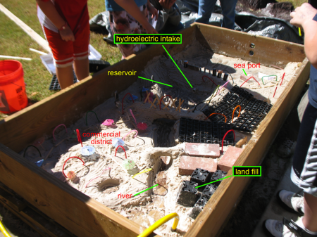
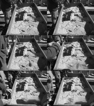
City in the sandbox

The City of Apolypse.

My small group that had trouble getting SimCity to behave itself on the laptop decided to go build their city in the sandbox instead.

They had just looked through all the civic buildings and zoning options before they took the outside option, so they started with SimCity’s basic introduction to urban planning concepts.

The group chose to locate their city on the ocean, with a river. Previously, when the class had looked up and down the U.S.’s eastern seaboard in Google Maps, we’d noticed that most of the bigger cities, like New York and Charleston were on or near estuaries. (We’d also noticed that most of the cities were protected by some sort of barrier from the direct influence of the oceans.)

[googleMap name=”New York City” description=”NYC on the river and ocean.” width=”480″ height=”400″ mapzoom=”8″ mousewheel=”false”]New York City[/googleMap]

This group gained some significant advantages over just playing the computer game because the sandbox model allowed them create features not built into the game.

In particular, they sculpted an earthen dam with a hydroelectric power plant, that was the centerpiece of their city.

By putting a dam across the estuary they could acquire both fresh water reservoir and hydroelectric power.

It’s probably not unfair to guess that the idea for the dam came primarily from our visit to the Pickwick Landing Hydroelectric Plant last year. I say so because the eight grader who came up with the idea was reminiscing about last year’s immersions for the rest of the day.

The decline and fall of Apocalypse.

The group did a great job, although they did site their landfill upstream of their reservoir. This became a problem because after they presented to the class they turned on the river. We relearned the biblical lesson about not building on the sand. This was not entirely unexpected though; the students had named the city Apocalypse.

The combination of computer simulation and physical model really worked well. So much so that two years from now, when I do this again, I think I’ll require at least one group to do the physical model. But it really worked for them to have at least seen the computer game so I’ll have to build that into the project too.

Island of Podiatry in the sandbox

I’m not terribly partial to the Island of Podiatry exercise where student produce a map of physiographic features, gulfs, archipelagos, plateaus and so on, starting with the outline of their feet. However, in considering alternatives I was thinking about how it could be made even more real, more tactile. My first thought was of having them sculpt the topography out of modeling clay, but then I realized that this would be a great use for our sandbox.

The weather’s cooled down a bit in the last week, but it should still be warm enough for students to want to be outside. All I’ll need to do is level the box (though this might be no small feat since it’s filled with sand), add about ten centimeters of water, and have them shape the island from their Island of Podiatry map. I’ll also probably need them to decide whose map they want to model.

DNAi: History of genetics and manipulating DNA

DNA. (from Wikipedia)

DNA interactive is another great resource for studying the history of genetics and how we manipulate and use it today (recommended by the indispensable Anna Clarke). They have lesson plans and nice pages on the modern techniques used to work with DNA.

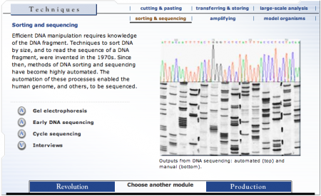
Image from the DNAi webpage on gel electrophoresis. Electrophoresis is a bit like chromatography which might make for a good demonstration.

I have not done much with genetic sequencing myself and I found the website interesting and informative. I have, however, written programs to get and work with the GenBank database, which is not that hard since they have some easy tools to work with. I would love to figure out how to get a sample sequenced and then run it through GenBank to identify it. It would so nicely integrate the curriculum, using a practical exercise to solve a problem (like what species are on the nature trail), while using the same tools and resources that scientists use, and tie wonderfully into the short stories in Mirable.

On having good conversations

Conversation, c. 1881. by French Impressionist Camille Pissarro. (Picture from Wikimedia Commons).

[A]s a general rule, conversations about how people have or will interact are interesting, and conversations about objects are dull. So steer toward topics that involve human perceptions and feelings, and away from objects and things. – Scott Adams, 2010.

Scott Adams, the cartoonist behind Dilbert, has some good thoughts on having a good conversation and active listening.

You’ve heard of the Kevin Bacon game, where every actor is just a few connections away from Kevin Bacon. Likewise, you almost always have something interesting in common with every other person. The trick is to find it. As with the Kevin Bacon game, you’d be surprised at how few questions it takes to get there.

Global Peace Index

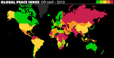
Global Peace Index for 2010, from Vision of Humanity.

The Vision of Humanity website publishes a wonderful, interactive map ranking countries based on peace. If you place the cursor over the country it gives you their rank. The U.S. is 85th out of 149. They have maps for 2007, 2008, 2009 and 2010.

The peace index is based on quite the number of factors, some subjective, including, “Perceived criminality in society”, “Respect for human rights”, “Weapons exports” and “Number of conflicts fought”. All these factors were weighed and tabulated based on the input of an international team. It’s assembled by the Institute for Economics and Peace who have a number of downloadable peace education teaching materials designed for 14-16 year olds on their website.

They have an excellent video (see below) explaining what the peace index is all about and the effect that peaceful societies have on economic growth.

The maps and video would be excellent additions to our discussions of war and peace. I especially like that they try to directly link peace with economic growth, which offers something almost tangible whose importance and implications students can fairly easily understand. I really like these resources.

Classroom Activities in Economics: Resource Guide Plus

From the Federal Reserve System.

I’ve had a number of posts based on stuff I learned this summer at the Fed. Most of it has been about the resources and tools they have available on their website and it can be a little intimidating trying to figure out how to actually use all of this data.

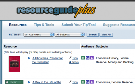
So the Fed has created Resource Guide Plus, a collection of activities, simulations, publications and tools for the classroom. The activities have pretty good instructions and use the resources available on the Fed’s website. They were kind enough to post the math and economics activity I worked on at the meeting (also posted here) in their Tips and Tools section.

The activities are searchable and geared mostly toward middle and high school though there are some elementary ones in there too.

Learn math and economics using GeoFRED

The activity below was created as part of the St. Louis Federal Reserve Bank’s Summer School Program session on using Data and Primary Source Documents. I plan to use it as a whole-class activity during the upcoming year and I’ll post updates after I try it (check the economics tag).

Unemployment rate by state - 1977 to 2009. Maps from GeoFRED.

Averaging and Graphing with GeoFRED

Objectives:

  • Introduce GeoFRED as a tool for analyzing real economic data over space.
  • Learn/practice graphing.
  • Practice basic averaging using real data.
  • Prepare and deliver group presentations.

Resources:

Initial presentation to entire class

Show animation of unemployment in the US (by state) over their lifetimes (e.g. 1998-2009). The pdf file Geofred-annual-unemp-1995-2009 has the maps from 1995 to 2009 that you can click through to animate. Alternatively, you can create the pdf yourself from the GeoFRED Graph. A final option, if you’re desperate, is to use the animated gif above.

  • Note: point out the effect of Hurricane Katrina on Louisiana (compare 2005 and 2006).
  • See if students can identify interesting changes that they are curious about. The intention is to get students interested in the data and asking questions and give ideas about why the changes have occurred in general and for specific states.

Group/individual work

The class picks a state that they’re interested in (everyone has to do the same state to bring the data back together at the end) and:

  • each group/individual gets the 12 months of data for one year in the time series (from the website).
  • They create a graph (line or bar students get the choice) of their 12 months of data.
    • Note: If we provide students with poster paper and a uniform scale for their axes they could merge their data at the end to create one very long graph. Alternately, if they all produce their own, very different, graphs they might produce nicer graphs that they’re more invested in, and better appreciate the need to calculate the averages when combining all the data.)
  • They average their 12 months of data to get the annual average.
  • Discuss among themselves why things might have changed the way they did over the year
    • Do research (perhaps the beige book archive (very good regional summaries) or burgundy books (can’t find a long archive) and/or Wikipedia) to find out about why the changes may have occurred.
    • Prepare a short presentation about their year for the rest of the class based on what they found (including their graph).

Class reconvenes

Now for presentations, discussion and integration.

  • Each group gives a short presentation about what they found.
  • The groups bring their averages together to plot a graph for the entire 12 years.
  • Discuss how things changed over time – recessions when and why.

Advanced work

Now that students know how to use GeoFRED they can pose and answer a research question, perhaps one that came up during the initial presentation of the animation.

Additional suggestions

Instead of doing this by state, we could do it by Fed district to see how the regional economic systems are very different.