Using a sequence of connected shapes to introduce algebra and graphing to pre-Algebra students.
Make a geometric shape–a square perhaps–out of toothpicks. Count the sides–4 for a square. Now add another square, attached to the first. You should now have 7 toothpicks. Keep adding shapes in a line and counting toothpicks. Now you can:
make a table of shapes versus toothpicks,
write the sequence as an algebraic expression
graph the number of shapes versus the number of toothpicks (it should be a straight line),
figure out that the increment of the sequence–3 for a square–is the slope of the line.
show that the intercept of the line is when there are zero shapes.
Then I had my students set up a spreadsheet where they could enter the number of shapes and it would give the number of toothpicks needed. Writing a small program to do the same works is the next step.
Converting a trigonometric function (sin curve) from Cartesian to polar coordinates. Source: “Cartesian to polar” by Kieff – Own work. Licensed under Public domain via Wikimedia Commons.
On the recommendation of Mr. Schmidt, two of my students have been quite fascinated over the last few days trying to solve problems on Project Euler. They’ve been working on them together to, I suspect, the detriment of some of their other classes, but as their math teacher I find it hard to object.
An example problem is something like this:
If we list all the natural numbers below 10 that are multiples of 3 or 5, we get 3, 5, 6 and 9. The sum of these multiples is 23.
Find the sum of all the multiples of 3 or 5 below 1000.
They’ve been solving them numerically using Python. It’s been quite fascinating to see.
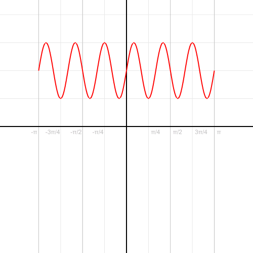
Frequency.
I’ve slapped together this simple VPython program to introduce sinusoidal functions to my pre-Calculus students.
Left and right arrow keys increase and decrease the frequency;
Up and down arrow keys increase and decrease the amplitude;
“a” and “s” keys increase and decrease the phase.
Amplitude.
The specific functions shown on the graph are based on the general function:
where:
A — amplitude
F — frequency
P — phase
Phase. Note how the curve seems to move backward when the phase increases.
When I first introduce sinusoidal functions to my pre-Calculus students I have them make tables of the functions (from -2π to 2π with an interval of π/8) and then plot the functions. Then I’ll have them draw sets of sine functions so they can observe different frequencies, amplitudes, and phases.
from visual import *

class sin_func:
    def __init__(self, x, amp=1., freq=1., phase=0.0):
        self.x = x
        self.amp = amp
        self.freq = freq
        self.phase = phase

        self.curve = curve(color=color.red, x=self.x, y=self.f(x), radius=0.05)
        self.label = label(pos=(xmin/2.0,ymin), text="Hi",box=False, height=30)

    def f(self, x):
        y = self.amp * sin(self.freq*x+self.phase)
        return y

    def update(self, amp, freq, phase):
        self.amp = amp
        self.freq = freq
        self.phase = phase
        self.curve.y = self.f(x)
        self.label.text = self.get_eqn()

    def get_eqn(self):
        if self.phase == 0.0:
            tphase = ""
        elif (self.phase > 0):
            tphase = u" + %i\u03C0/8" % int(self.phase*8.0/pi)
        else:
            tphase = u" - %i\u03C0/8" % int(abs(self.phase*8.0/pi))
        print self.phase*8.0/pi

        txt = "y = %ssin(%sx %s)" % (simplify_num(self.amp), simplify_num(self.freq), tphase)
        return txt

def simplify_num(num):
    if (num == 1):
        snum = ""
    elif (num == -1):
        snum = "-"
    else:
        snum = str(num).split(".")[0]+" "
    return snum

amp = 1.0
freq = 1.0

damp = 1.0
dfreq = 1.0

phase = 0.0
dphase = pi/8.0

xmin = -2*pi
xmax = 2*pi
dx = 0.1

ymin = -3
ymax = 3

scene.width=640
scene.height=480

xaxis = curve(pos=[(xmin,0),(xmax,0)])
yaxis = curve(pos=[(0,ymin),(0,ymax)])

x = arange(xmin, xmax, dx)
#y = f(x)

func = sin_func(x=x)
func.update(amp, freq, phase)

while 1: #theta <= 2*pi:
    rate(60)

    if scene.kb.keys: # is there an event waiting to be processed?
        s = scene.kb.getkey() # obtain keyboard information
        #print s
        if s == "up":
            amp += damp
        if s == "down":
            amp -= damp
        if s == "right":
            freq += dfreq
        if s == "left":
            freq -= dfreq

        if s == "s":
            phase += dphase
        if s == "a":
            phase -= dphase

        func.update(amp, freq, phase)
        #update_curve(func, y)
One of the jobs my class helped with at the Heifer Ranch was planting garlic in the Heifer CSA garden. The gardeners had laid rows and rows of this black plastic mulch to keep down the weeds, protect the soil, and help keep the ground warm over the winter.
Laying down the plastic using a tractor. The mechanism simultaneously lays down a drip line beneath the plastic for watering.
We then used an improvised puncher to put holes in the plastic through which we could plant cloves of garlic pointy side up. The puncher was a simple flat piece of plywood, about one foot by three feet in dimensions, with a set of bolts drilled through. The bolts extended a few inches below the board and would be pressed through the black plastic. Two handles on each side of the board made it easier for two people to maneuver and punch row after row of holes.
Punching holes in the plastic.
As I took my turn punching holes, we did the math to figure out just how much garlic we were planting. A quick count of the last imprint of the puncher showed about 15 holes per punch. Each row was about 200 feet long, which made for approximately 3,000 heads of garlic per row.
We managed to plant one and a half rows. That meant about 4,500 garlic cloves. With ten people planting, that meant each person planted about 450 cloves. Not bad for an afternoon’s work.
Here’s another attempt to create embeddable graphs of mathematical functions. This one allows users to enter the equation in text form, has the option to enter the domain of the function, and expects there to be multiple functions plotted at the same time. Instead of writing the plotting functions myself I used the FLOT plotting library.
This year I’m trying teaching pre-Calculus (and it should work for some parts of algebra as well) based on this concept map to use as a general way of looking at functions. Each different type of function can by analyzed by adapting the map. So linear functions should look like this:
Adapting the general concept map for linear functions.
You’ll note the bringing water to a boil lab at the bottom left. It’s an adaptation of the melting snow lab my middle schoolers did. For the study of linear equations we’ll define the function using piecewise defined functions.
The relationship between temperature and time on a hotplate. The different parts of the graph can be defined by a piecewise function. Graph by A.F.


