Using Real Data, and Least Squares Regression, in pre-Calculus

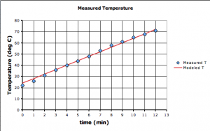
The equation of our straight line model (red line) matches the data (blue diamonds) pretty well.

One of the first things that my pre-Calculus students need to learn is how to do a least squares regression to match any type of function to real datasets. So I’m teaching them the most general method possible using MS Excel’s iterative Solver, which is pretty easy to work with once you get the hang of it.
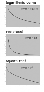
Log, reciprocal and square root functions can all be matched using least squares regression.

I’m teaching the pre-Calculus using a graphical approach, and I want to emphasize that the main reason we study the different classes of functions — straight lines, polynomials, exponential curves etc.— is because of how useful they are at modeling real data in all sorts of scientific and non-scientific applications.

So I’m starting each topic with some real data: either data they collect (e.g. bring water to a boil) or data they can download (e.g. atmospheric CO2 from Mauna Loa). However, while it’s easy enough to pick two points, or draw a straight line by eye, and then determine its linear equation, it’s much trickier if not impossible when dealing with polynomials or transcendental functions like exponents or square-roots. They need a technique they can use to match any type of function, and least squares regression is the most commonly used method of doing this. While calculators and spreadsheet programs, like Excel, use least squares regression to draw trendlines on their graphs, they can’t do all the different types of functions we need to deal with.

The one issue that has come up is that not everyone has Excel and Solver. Neither OpenOffice nor Apple’s spreadsheet software (Numbers) has a good equivalent. However, if you have a good initial guess, based on a few datapoints, you can fit curves reasonably well by changing their coefficients in the spreadsheet by hand to minimize the error.

I’m working on a post on how to do the linear regression with Excel and Solver. It should be up shortly.

Notes

If Solver is not available in the Tools menu you may have to activate it because it’s an Add In. Wikihow explains activation.

Some versions of Excel for the Mac don’t have Solver built in, but you can download it from Frontline.

Bending a Soccer Ball

Students from the University of Leicester have published a beautiful short research paper (pdf) on the physics of curving a soccer ball through the air.

It has been found that the amount a football bends depends linearly on the speed of the ball and the amount of spin.

— Sandhu et al., 2011: How to score a goal (pdf) in the University of Leicester’s Journal of Physics Special Topics

They derive the relationship from Bernoulli’s equation using some pretty straightforward algebra. The force (F) perpendicular to the ball’s motion that causes it to curl is:

F = 2 \pi R^3 \rho \omega v

and the distance the ball curls can be calculated from:

D = \frac{\pi R^3 \rho \omega}{ v m } x^2

where:

  • F = force perpendicular to the direction the ball is kicked
  • D = perpendicular distance the ball moves to the direction it is kicked (the amount of curl)
  • R = radius of the ball
  • ρ = density of the air
  • ω = angular velocity of the ball
  • v = velocity of the ball (in the direction it is kicked)
  • m = mass of the ball
  • x = distance traveled in the direction the ball is kicked

The paper itself is an excellent example of what a short, student research paper should look like. And there are number of neat followup projects that advanced, high-school, physics/calculus students could take on, such as: considering the vertical dimension — how much time it take for the ball to rise and fall over the wall; creating a model (VPython) of the motion of the ball; and adding in the slowing of the ball due to air friction.

ScienceDaily

A Review of Fractions: Based on Khan Academy Lessons

This is a basic review of working with fractions using lessons and practice sets from the Khan Academy.

1. Adding Fractions with a Common Denominator

The first topic — adding fractions –ought to be really easy for algebra students, but it allows them to become familiar with the Khan Academy website and doing the practice sets.

Now do the Practice Set.

OPTIONAL: Subtracting fractions with a common denominator works the same way. Students may do this practice set if they find it useful.

2. Adding Fractions with a Different Denominator

This is usually a helpful review.

The practice set.

3. Multiplying and Dividing Fractions

A good review that helps build up to working with radical numbers.

Multiplying fractions:

Do the multiplying fractions practice set.

Dividing Fractions:

Dividing fractions practice set.

4. Converting Fractions to Decimals

The last review is on how to convert fractions to decimals.

Now try the practice set for ordering numbers.

5. Next: Working with Square Roots

Starting Algebra too Early?

There’s been a push for students to take algebra earlier and earlier, yet there are some serious pedagogic arguments that early algebra might not be a great idea for many, if not most, students. A fascinating paper by Clotfelter et al., (2012) (pdf) showed pretty clearly that for a large number of students, taking algebra earlier actually resulted in worse performance in not just algebra, but the follow-up classes as well (geometry and pre-calculus for example), compared to students who waited to take the subject. Indeed the Charlotte-Mecklenburg School District (the district studied in the article) actually reversed their policy of having students take algebra in 8th grade.

Students affected by the acceleration initiative scored significantly lower on end-of-course tests in Algebra I, and were either no more likely or significantly less likely to pass standard follow-up courses, Geometry and Algebra II

— Clotfelter et al., (2012): The Aftermath of Accelerating Algebra: Evidence from a District Policy Initiative (pdf) via NY Fed.

The argument for early algebra comes from the correlation between early algebra and better performance on standardized tests, and more advanced math classes in high school. But the authors here indicate that forcing students to take algebra early does not result in the same outcomes.

The argument against early algebra is based on the research that shows formal thinking develops during adolescence, and the belief that to do well in algebra requires the abstract thinking skills that are seated in the maturing prefrontal cortex. Until students are ready for the abstract thinking required (which happens at different times for each student), they will struggle with algebra.

Algebra provides an essential foundation for further mathematics, which is why it is my strong preference that students progress by demonstrating mastery of the topics at their own pace rather than struggling through the class.

Reasons to Study Algebra: Economics


I hope you think that I am an acceptable writer, but when it comes to economics I speak English as a second language: I think in equations and diagrams, then translate.

— Krugman (1996): Economic Culture Wars in Slate

I sometimes get the question: Why do I have to learn algebra? Followed by the statement: I’m never going to have to use it again. My response is that it’s a bit like learning to read; you can survive in society being illiterate, but it’s not easy. The same goes for algebra, but it’s a little more complex.

Paul Krugman argues for the importance of algebra for anyone thinking about economics, the economy, and what to do about it. Even at the basic level, economists think in mathematical equations and algebraic models, then they have to translate their thoughts into English to communicate them. People who are not familiar with algebra are at a distinct advantage.

There are important ideas … that can be expressed in plain English, and there are plenty of fools doing fancy mathematical models. But there are also important ideas that are crystal clear if you can stand algebra, and very difficult to grasp if you can’t. [my emphasis] International trade in particular happens to be a subject in which a page or two of algebra and diagrams is worth 10 volumes of mere words. That is why it is the particular subfield of economics in which the views of those who understand the subject and those who do not diverge most sharply.

— Krugman (1996): Economic Culture Wars in Slate

P.S. In the article, he also points out the importance of algebra in the field of evolutionary biology.

Serious evolutionary theorists such as John Maynard Smith or William Hamilton, like serious economists, think largely in terms of mathematical models. Indeed, the introduction to Maynard Smith’s classic tract Evolutionary Genetics flatly declares, “If you can’t stand algebra, stay away from evolutionary biology.” There is a core set of crucial ideas in his subject that, because they involve the interaction of several different factors, can only be clearly understood by someone willing to sit still for a bit of math.

Reddit

Momentum

A ball rolling down a ramp hits a car which moves off uphill. Can you come up with an experiment to predict how far the car will move if the ball is released from any height? What if different masses of balls are used?

Students try to figure out the relationship between the ball's release height and how far the car moves.

For my middle school class, who’ve been dealing with linear relationships all year, they could do this easily if the distance the car moves is directly proportional to height from which the ball was released?

The question ultimately comes down to momentum, but I really didn’t know if the experiment would work out to be a nice linear relationship. If you do the math, you’ll find that release height and the maximum distance the car moves are directly proportional if the momentum transferred to the car by the ball is also directly proportional to the velocity at impact. Given that wooden ball and hard plastic car would probably have a very elastic collision I figured there would be a good chance that this would be the case and the experiment would work.

It worked did well enough. Not perfectly, but well enough.

Curious Correlations

The Correlated website asks people different, apparently unrelated questions every day and mines the data for unexpected patterns.

In general, 72 percent of people are fans of the serial comma. But among those who prefer Tau as the circle constant over Pi, 90 percent are fans of the serial comma.

Correlated.org: March 23’s Correlation.

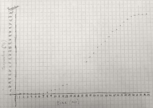
Two sets of data are said to be correlated when there is a relationship between them: the height of a fall is correlated to the number of bones broken; the temperature of the water is correlated to the amount of time the beaker sits on the hot plate (see here).

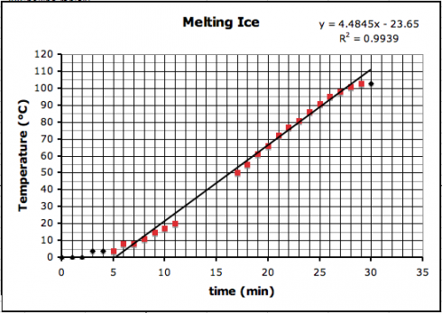
A positive correlation between the time (x-axis) and the temperature (y-axis).

In fact, if we can come up with a line that matches the trend, we can figure out how good the trend is.

The first thing to try is usually a straight line, using a linear regression, which is pretty easy to do with Excel. I put the data from the graph above into Excel (melting-snow-experiment.xls) and plotted a linear regression for only the highlighted data points that seem to follow a nice, linear trend.

Correlation between temperature (y) and time (x) for the highlighted (red) data points.

You’ll notice on the top right corner of the graph two things: the equation of the line and the R2, regression coefficient, that tells how good the correlation is.

The equation of the line is:

  • y = 4.4945 x – 23.65

which can be used to predict the temperature where the data-points are missing (y is the temperature and x is the time).

You’ll observe that the slope of the line is about 4.5 ºC/min. I had my students draw trendlines by hand, and they came up with slopes between 4.35 and 5, depending on the data points they used.

The regression coefficient tells how well your data line up. The better they line up the better the correlation. A perfect match, with all points on the line, will have a regression coefficient value of 1.0. Our regression coefficient is 0.9939, which is pretty good.

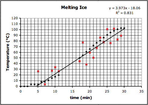
If we introduce a little random error to all the data points, we’d reduce the regression coefficient like this (where R2 is now 0.831):

Adding in some random error causes the data to scatter more, making for a worse correlation. The black dots are the original data, while the red dots include some random error.

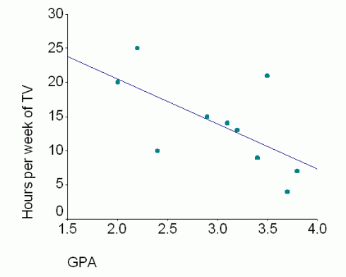
The correlation trend lines don’t just have to go up. Some things are negatively correlated — when one goes up the other goes down — such as the relationship between the number of hours spent watching TV and students’ grades.

The negative correlation between grades and TV watching. Image: Lanthier (2002).

Correlation versus Causation

However, just because two things are correlated does not mean that one causes the other.

A jar of water on a hot-plate will see its temperature rise with time because heat is transferred (via conduction) from the hot-plate to the water.

On the other hand, while it might seem reasonable that more TV might take time away from studying, resulting in poorer grades, it might be that students who score poorly are demoralized and so spend more time watching TV; what causes what is unclear — these two things might not be related at all.

Which brings us back to the Correlated.org website. They’re collecting a lot of seemingly random data and just trying to see what things match up.

Curiously, many scientists do this all the time — typically using a technique called multiple regression. Understandably, others are more than a little skeptical. The key problem is that people too easily leap from seeing a correlation to assuming that one thing causes the other.