Growing a Vehicle: Sustainable Production

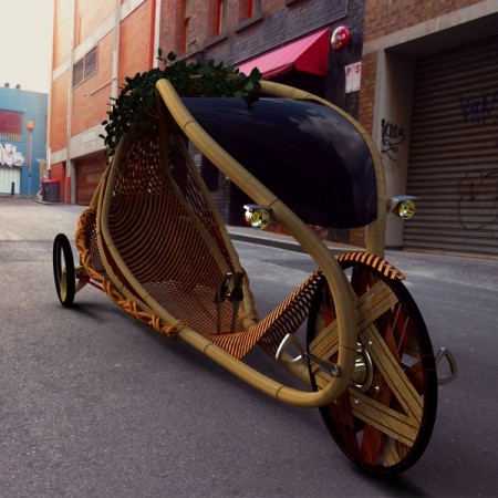
The bamboo frame was grown into the needed shape by Alexander Vittouris. Image from Good Design Australia

Bamboo can grow as fast as 1 meter per day. Alexander Vittouris, a student at Monash University, used this fact to shape the stem into the frame for this human-powered vehicle that he calls the Ajiro. The idea is to create a more sustainable means of production.

Derived from the field of arborsculpture [my link], which specialises in the specific modification and grafting of plants to create shaped structures, the conceptual design, the Ajiro, involves using these principals to create a ‘clean footprint’ urban and recreational vehicle – a grown vehicle. Using bamboo, with its rapid growth rate (as much as one meter in a 24hr period), coupled with its structural integrity make it an ideal candidate for the formation of unique urban personal mobility.

— Vittouris (2011): Ajiro – Naturally grown urban personal mobility

State of Green has a good description of the process.

Serialized Canticle

The science fiction classic,A Canticle for Leibowitz, is available in the public domain as an adapted audio serial from Old Time Radio via the Internet Archive.

Inspired by the author’s participation in the Allied bombing of the monastery at Monte Cassino during World War II, the novel is considered a masterpiece by literary critics. It has been compared favorably with the works of Evelyn Waugh, Graham Greene, and Walker Percy, and its themes of religion, recurrence, and church versus state have generated a significant body of scholarly research.

Internet Archive

You can play it here.

Printable Cups: And Other 3D objects

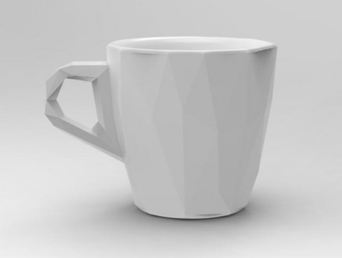
A ceramic cup, from the 3d printing website Shapeways (created by Cunicode as part of a One Coffee Cup a Day series of designs).

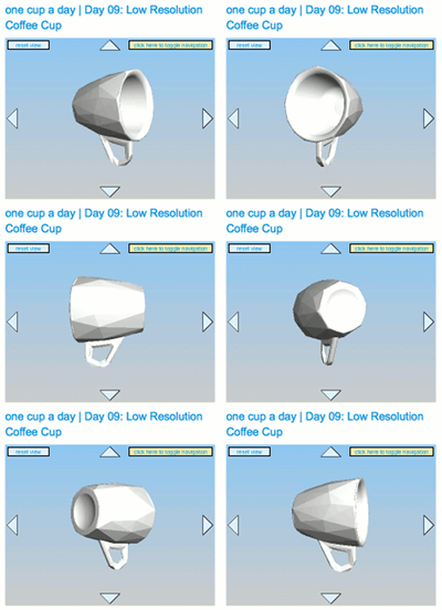
Following up on Fully Printed‘s vision of a future with 3d printing, I came across Shapeways, a website that lets you upload 3d designs and “prints” them in your choice of objects. One user, Cunicode chose to make different cup design every day. I’m quite taken by their Low Resolution cup.

In the finished cup, you can clearly see the quadrilateral and triangular facets that make up the 3d design’s mesh. I like that.

A 3d view of the Low Resolution Coffee Cup.

So now I’m just waiting until something interesting occurs to me. Shapeways would be a great place for creating some unique manipulatives.

Build Your Own Solar System: An Interactive Model

National Geographic has a cute little game that lets you create a two-dimensional solar system, with a sun and some planets, and then simulates the gravitational forces that make them orbit and collide with each other. The pictures are pretty, but I prefer the VPython model of the solar system forming from the nebula.

The models starts off with a cloud of interstellar bodies which are drawn together by gravitational attraction. Every time they collide they merge creating bigger and bigger bodies: the largest of which becomes the sun near the center of the simulation, while the smaller bodies orbit like the planets.

This model also comes out of Sherwood and Chabay’s Physics text, but I’ve adapted it to make it a little more interactives. You can tag along for a ride with one of the orbiting planets, which, since this is 3d, makes for an excellent perspective (see the video). You can also switch the trails on and off so you can see the paths of the planetary bodies, note their orbits and see the deviations from their ideal ellipses that result from the gravitational pull of the other planets.

I’ve found this model to be a great way to introduce topics like the formation of the solar system, gravity, and even climate history (the ice ages over the last 2 million years were largely impelled by changes in the ellipticity of the Earth’s orbit).

National Geographic’s Solar System Builder is here.

Mapping Internet Space

A map of the internet from the Opte Project.

The Opte Project has produced a number of excellent maps of the internet. There is a profound beauty in the immensity of the interconnections that’s reminiscent of the suffusion of stars that can be seen in Milky Way on a dark night on an isolated beach. Unfortunately, their website seems to have not been updated since 2005.

Signs of Water on Mars?

Water is necessary for life as we know it, which is why the search for life on other planets and moons in the solar system has been focused first of all on finding water. NASA now reports signs of water on Mars. Salty water perhaps, and even now there is no direct evidence that it is water and not some other fluid, but this is the first evidence of there being liquid water on Mars today.

The video above explains, and the BBC has a good article.

Appropriate Technology: Innovation with Light

Not a lot of light penetrates the galvanized steel roofs that are ubiquitous in slums around the world. Alfredo Moser came up with one ridiculously cheap solution (via the World Social Forum, 2011).

While this the kind of cheap, elegant solution I would go for in a heartbeat, I’m pretty sure my wife would veto. For the more stylistically conscious – and for people with a bit more money in their pockets – there are $2.00 LED lights advocated by The Appropriate Technology Collaborative (ATC). A lot of people in dire poverty live in the slums, but that’s not the case for everyone.

The ATC’s seems to focus on projects designed by university students and implemented in the third world. If they work, the designs are published with a Creative Commons license so that other Non Governmental Organizations (NGO’s) that work in poorer countries can use and distribute them. Their blog has a lot of good information. And, there’s also the Global Bucket project that I’m still keeping an eye on.

Making Text Easier to Read

Christian Boer, who is dyslexic, has come up with a new font designed to make text easier for dyslexics to read. There are a number of changes to the letters themselves, such as making the bottoms heavier, enlarging the openings, and making similar letters look more different. But, Boer’s website also offers advice on how to lay out text: separate paragraphs with space; avoid right justification; use columns instead of having text across the entire page, and so on.

Unfortunately, the Dyslexie font is not yet available in the U.S..

When I was choosing the layout for this blog, I was aiming for something that would be easy and enjoyable for me to read; I tend to be a little picky about my reading and writing environment. Interestingly, many of my own preferences align well with the ones noted above, but there seem to be a number of improvements I can still make to improve readability for everyone. Abigail Marshall has some additional advice on Web Design for Dyslexic Users.