Surveys say …

Another nice resource that provides neat graphs of real data that are easy for students to understand is Pollster.com. The graphs of survey results are constantly updated and, if you want to, you can go into how they were created (survey questions, averages etc.). They’re great for current event discussions and research projects.

In addition to the national polls, like the president’s job approval (see below), the site also has charts for state level races, like for governor, which are handy around election time.

Pollster.com aggregates polls, because, depending on how a question is phrased, each poll will have it’s own bias. However, since not all of the poll data is freely available to the public, the sites of the major polling organizations, like GALLUP, are also quite useful. The polling organizations tend to have a much wider variety of poll results available. Gallup in particular provides some very nice graphs.

Mathematics in the natural world

Mathematics is the language of science. Scientists refine and refine their observations of the complexity of the natural world and try to boil these complex observations down to simple relationships, relationships that are expressed in mathematics. This, I think, is part of the human condition. Our brains are designed to extract simple relationships, heuristics, rules of thumb, from the observations of our senses. It is why Einstein’s equation, E=mc2, has captivated our imagination for so long, why physicists struggle to find the unified theory, and why fractals are so fascinating.

Cristóbal Vila’s short video (found via The Daily Dish) captures some of the magic of the relationship between mathematics and the world.

Statistical significance

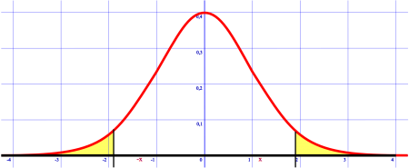
Normal distribution with 95% unshaded. Adapted from Wikimedia Commons.

A discussion of statistical significance is probably a bit above middle school level, but I’m posting a note here because it is a reminder about the importance of statistics. In fact, students will hear about confidence intervals when they hear about the margin of error of polls in the news and the “significant” benefits of new drugs. Indeed, if you think about it, the development of formal thinking skills during adolescence should make it easier for students to see the world from a more probabilistic perspective, noticing the shades of grey that surround issues, rather that the more black and white, deterministic, point of view young idealists tend to have. At any rate, statistics are important in life but, according to a Science Magazine article, many scientists are not using them correctly.

One key error is in understanding the term “statistically significant”. When Ronald A. Fisher came up with the concept he arbitrarily chose 95% as the cutoff to test if an experiment worked. The arbitrariness is one part of the problem, 95% still means there is one chance in twenty that the experiment failed and with all the scientists conducting experiments, that’s a lot of unrecognized failed experiments.

But the big problem is the fact that people conflate statistical significance and actual significance. Just because there is a statistically significant correlation between eating apples and acne, does not mean that it’s actually important. It could be that this result predicts that one person in ten million will get acne from eating apples, but is that enough reason to stop eating apples?

It is a fascinating article that deals with a number of other erroneous uses of statistics, but I’ve just spent more time on this post than I’d planned (it was supposed to be a short note). So I’d be willing to bet that there is a statistically significant correlation between my interest in an issue and the length of the post (and no correlation with the amount of time I intended to spend on the post).

Boredom in a fractal world

Brazilian butterfly Doxocopa laurentia (from Wikipedia)

A few of my students have been complaining that we don’t do enough different things from week to week for them to write a different newsletter article every Friday. PE, after all, is still PE, especially if we’re playing the same game this week as we did during the last.

So I’ve been thinking of ways to disabuse them of the notion that anything can be boring or uninteresting in this wonderful, remarkable world. A world of fractal symmetry, where a variegated leaf, a deciduous tree and a continental river system all look the same from slightly different points of view. A counterintuitive world where the smallest change, a handshake at the end of a game, or a butterfly flapping its wings can fundamentally change the nature of the simplest and the most complex systems.

“Chaos is found in greatest abundance wherever order is being sought. It always defeats order, because it is better organized.”
— Terry Pratchett (Interesting Times)

Fractal trees (from Wikimedia Commons)

There are two things I want to try, and I may do them in tandem. The first is to give special writing assignments where students have to describe a set of increasingly simple objects, with increasingly longer minimum word limits. I have not had to impose minimum word limits for writing assignments because peer sharing and peer review have established good standards on their own. Describing a tree, a coin, a 2×4, a racquetball in a few hundred words would be an exercise in observation and figurative language.

To do good writing and observation it often helps to have good mentor texts. We’re doing poetry this cycle and students are presenting their poems to the class during our morning community meetings. It had been my intention to make this an ongoing thing, so I think I’ll continue it, but for the next phase of presentations, have them chose descriptive poems like Wordsworth’s “Yew Trees“*.

Image from Wikimedia Commons

The world is too interesting a place to let boredom get between you and it.

* An excellent text for a Socratic dialogue would be the first page of Michael Riffaterre’s article, Interpretation and Descriptive Poetry: A Reading of Wordsworth’s “Yew-Trees”. It’s testing in its vocabulary but remarkably clear in thought if you can get through it.

Math map

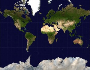
When introducing the x,y coordinate system using a world map it is most effective if you use the right type of map projection. Most maps use a Mercator projection which stretches thing out as you get closer to the poles. You can see this in how the latitude lines get further apart as you get closer to higher latitudes and Antarctica and Greenland get all stretched out.

Mercator map from Wikimedia Commons.

The Mercator map is great for navigation, because if you measure angles on the map (bearings) between two places, you get the right bearing to sail your ship.

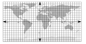
The better map to use for demonstrating the coordinate system would have an equirectangular projection, where all of the lines of latitude and longitude are equally spaced. These are harder to find, so I’m posting here a background map with the latitude and longitude marked on it (in 10 degree increments).

Equirectangular world map. Click on the image for a larger version. This is image is free to use if you cite this website (see cc-by-nc).

Notice the difference in sizes between the maps and the size of Greenland.

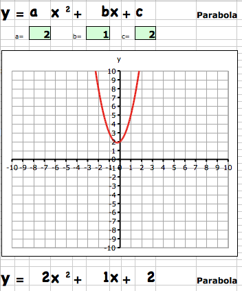
I’m also posting here, because it might be useful, a simple linear graph in Excel (or for OpenOffice) that simply plots lines if you enter the equation in slope-intercept form. There are lots of websites that let you do some really cool things (I’ll post about them later), but sometimes the simplest is what you want.

Geometry and the height of the mountains on the moon

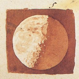
Galileo's image of the moon
Galileo's map of the moon.

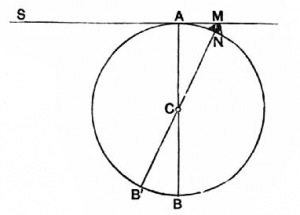
Galileo Galilei matched careful observation of sunlight and shadows on the moon, with some beautiful geometry to estimate the height of lunar mountains, in 1609. He needed the Pythagoras’ Theorem and the quadratic formula, both of which middle school students should be familiar. Larry Phillips has a nice post describing how Galileo did the math. The image below (from Pioneers of Science shows how to get started.

From the Gutenberg Project eBook of Pioneers of Science by Oliver Lodge.