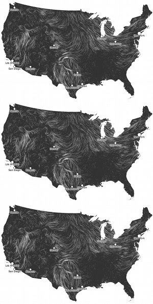
HINT.FM has an amazing animation of winds over the U.S.. A major part of the awesomeness is that it’s updated hourly from the National Weather Service’s weather database, which has an awful lot of excellent data available.
Middle and High School … from a Montessori Point of View

HINT.FM has an amazing animation of winds over the U.S.. A major part of the awesomeness is that it’s updated hourly from the National Weather Service’s weather database, which has an awful lot of excellent data available.

I took a half-day trip during spring break (somewhere around the 31st) to the Shaw Nature Reserve in Gray Summit. I was hoping to find some books on native, Missouri, flora and fauna, and see if the Reserve would be a good place for a field trip (they have sleeping facilities so even overnight trips are a possibility).
I found a number of books, including a nice one on mushrooms, and while I could have, I did not pick up one on wildflowers (of which there were several). Of course, spring is the perfect time to see wildflowers, especially since we ended up hiking the Wildflower Trail, so I’m probably going to have to go back sometime soon.
The lady at the main office (where you pay $5/adult) recommended we take the Wildflower Trail and then cut down south to the sandbar on the Meramec River, which is an excellent place for skipping rocks. She also recommended I take my two kids to their outdoor “classroom” for some real, unstructured play.
View Shaw Nature Reserve – Wildflower Trail in a larger map
Without a reference book, I’ve had to resort to the web for identifications, with only a little success, so I’ll post a few of my photographs here and update as I identify them.
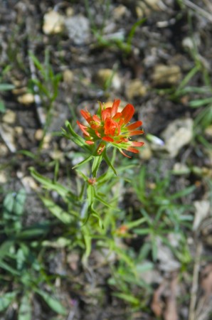
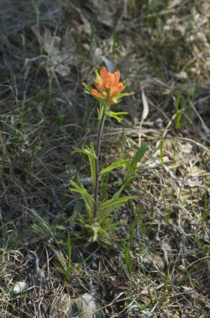
The following two pictures are of a flower that was found covering the hillslope meadows; open areas with short grass.
Like little stars in the daylight, these small, white flowers meadow flowers almost sparkle.

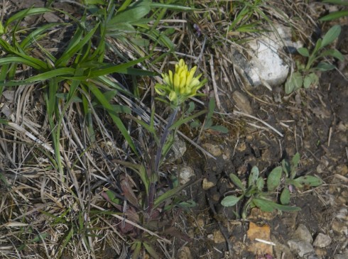
Pretty, small, yellow, meadow flowers.

These bent-over flowers can be found on the lower, shadier edges of the hillslope meadows.


Iris’ were also in bloom.

Another herbaceous, yellow flower.
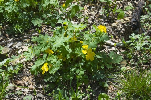
More, tiny, delicate flowers.

Once you get under the canopy, you run into some broader leaved plants and their own, interesting flowers.

We ended up spending a lot of time on the sandbar, learning to skip rocks and hunting for clams, but I save that for another post. And we never did get to the play area; that’ll have to wait for the next trip.
This wonderful image explores how different groups of people see (and think about) astrobiology.

This NASA video updates us on the search for Earth-like planets around other stars. It overviews what’s been found, and outlines some upcoming missions.
The key to finding a planet hospitable to life (as we know it) is finding one with water at the surface. We’ve found large waterworlds that are too large and hot, with “thick, steamy atmosphere[s]”.
We’ve also found Earth-sized planets but they’re, mostly, too close to their stars to support liquid water, and it’s hard to tell what their atmospheres are like because they’re so far away. One of NASA’s upcoming missions, one will look at the light reflected off Earth-sized planets to determine the composition of atmospheres: the technique is called transit spectroscopy, and is based on detecting the emission spectra of the gasses in the atmosphere.
An excellent series by the American Chemical Society starts with the basics of, “How to Write a Paper to Communicate Your Research,” but also addresses the question of why publish your research. It ought to help my students understand why I’m so insistent on lab reports.
NASA’s Perpetual Ocean visualizations are excellent animations of the oceans’ surface currents.
One of my physics students is working on a project to demonstrate interference in sound waves, so I generated a few sound files with different wavelengths for her to experiment with.

Using SoX, you can generate waves by inputing the frequency you want (using the synth command). The frequency (![]() ) depends on the wavelength (
) depends on the wavelength (![]() ) and speed (
) and speed (![]() ) of the sound waves through air.
) of the sound waves through air.
The speed of sound through the air depends on the temperature (it’s a linear relationship). Hyperphysics has a nice Speed of Sound in Air calculator, which tells me that at room temperature (about 25 ºC):
Speed of Sound in Air:
v = 347 m/s
Using the formula above (or sengpielaudio’s wave calculator) we can calculate the frequency we need for any wavelength.
For example, if we wanted a 2 meter wavelength:
Which sounds like this: 2m.mp3. (Note that 1 cycle per second equals 1 hertz, so 173.5 s-1 = 173.5 Hz).
The tone files I’ve created are below (the ones greater than 1 m may work best, but I’ve included the others for completeness):
| Wavelength | Frequency | Sound File (mp3) |
|---|---|---|
| 0.1 m | 3470 Hz | 10cm.mp3 |
| 0.25 m | 1388 Hz | 25cm.mp3 |
| 0.5 m | 694 Hz | 50cm.mp3 |
| 1 m | 347 Hz | 1m.mpg |
| 2 m | 173.5 Hz | 2m.mp3 |
| 3 m | 116 Hz | 3m.mp3 |
The SoX command to create the 2 m sound file (that lasts for 60 seconds) is:
> sox -n 2m.mp3 synth 60 sin 173.5
On the SoX manual page, look up the synth command.
WaveWindow is a nice, shareware ($12) oscilloscope for the Mac, though it does not show the longer wavelengths very nicely.
The Correlated website asks people different, apparently unrelated questions every day and mines the data for unexpected patterns.
In general, 72 percent of people are fans of the serial comma. But among those who prefer Tau as the circle constant over Pi, 90 percent are fans of the serial comma.
— ᔥ Correlated.org: March 23’s Correlation.
Two sets of data are said to be correlated when there is a relationship between them: the height of a fall is correlated to the number of bones broken; the temperature of the water is correlated to the amount of time the beaker sits on the hot plate (see here).
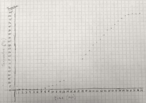
In fact, if we can come up with a line that matches the trend, we can figure out how good the trend is.
The first thing to try is usually a straight line, using a linear regression, which is pretty easy to do with Excel. I put the data from the graph above into Excel (melting-snow-experiment.xls) and plotted a linear regression for only the highlighted data points that seem to follow a nice, linear trend.
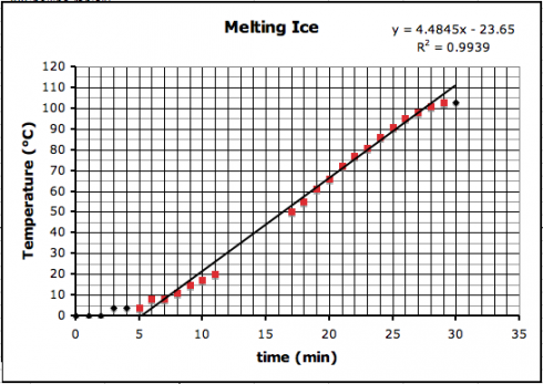
You’ll notice on the top right corner of the graph two things: the equation of the line and the R2, regression coefficient, that tells how good the correlation is.
The equation of the line is:
which can be used to predict the temperature where the data-points are missing (y is the temperature and x is the time).
You’ll observe that the slope of the line is about 4.5 ºC/min. I had my students draw trendlines by hand, and they came up with slopes between 4.35 and 5, depending on the data points they used.
The regression coefficient tells how well your data line up. The better they line up the better the correlation. A perfect match, with all points on the line, will have a regression coefficient value of 1.0. Our regression coefficient is 0.9939, which is pretty good.
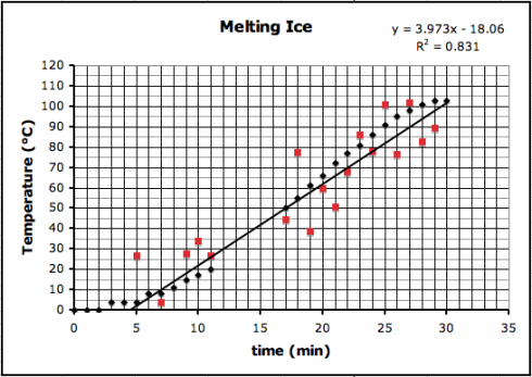
If we introduce a little random error to all the data points, we’d reduce the regression coefficient like this (where R2 is now 0.831):
The correlation trend lines don’t just have to go up. Some things are negatively correlated — when one goes up the other goes down — such as the relationship between the number of hours spent watching TV and students’ grades.
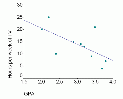
However, just because two things are correlated does not mean that one causes the other.
A jar of water on a hot-plate will see its temperature rise with time because heat is transferred (via conduction) from the hot-plate to the water.
On the other hand, while it might seem reasonable that more TV might take time away from studying, resulting in poorer grades, it might be that students who score poorly are demoralized and so spend more time watching TV; what causes what is unclear — these two things might not be related at all.
Which brings us back to the Correlated.org website. They’re collecting a lot of seemingly random data and just trying to see what things match up.
Curiously, many scientists do this all the time — typically using a technique called multiple regression. Understandably, others are more than a little skeptical. The key problem is that people too easily leap from seeing a correlation to assuming that one thing causes the other.