Even without the text descriptions, the pictures are wonderfully composed and evocative. I think I’m going to have to add this one to our library.
An interesting project would be to have my students take their own pictures of their rooms. Just in the book, some of the contrasts are quite startling.
OK. For someone like me this map is just ridiculously addictive. Produced by Revolver Maps, it shows the locations of everyone who’s visited the Muddle since March 5th (2011). If you click on the map it will take you to their page where you can find out more about the locations of all those dots.
The points on the map are a fascinating result of a combination of population distribution, language, technologic infrastructure (and wealth), and the miscellaneous topics on which I post.
Hits on the Muddle (blue circles) after two days, overlayed on a population density map of the U.S.. (Population density map from the USDA).
Overlaying at the location of hits after two days, on a population density map of the U.S. shows the obvious: the more people there are, the more likely it is that someone would stumble upon my blog. The eastern half of the U.S. with its higher populations are well represented, as is the west coast, while the hits in between come from the major population centers.
The pattern of hits from Australia shows very precisely that the major population centers are along the coast and not in the arid interior.
Map showing the hits on the Muddle (March 5-7) from Africa versus population density.
Africa, however, tells a much different story. The large population centers are along the equatorial belt of sub-Saharan Africa. But even now, there are very few if any hits from that region. I suspect that’s largely because of language and lack of access to the internet. The Muddle is not exactly the most popular on the internet, so it probably takes a lot of people on computers for a few to find their way to it. Contrast sub-Saharan Africa to South Africa, which is relatively wealthy, uses English as its lingua franca (working language), and has seen at least a few people hit the Muddle.
Members of the Commonwealth of Nations. Most of these countries were once part of the British Empire. (Image from Wikimedia Commons User:Applysense.)
Language also plays in big role in the pattern of hits from Europe and Asia. There are many English speakers in western Europe, a very high population density, and so a lot of hits, but the British Isles, as might be expected, are particularly well represented. Similarly in Asia, the members of the Commonwealth are show up disproportionately.
From the middle east, there have been a several hits from the wealthy small states like Bahrain and Qatar, but also a number from Egypt. The Egyptian interest in particular seems to stem from my posts on the recent revolution. No-one from that part of the world has commented on any of it so far, so I have no idea if they find the posts positive, negative, indifferent or whatever. I’d be curious to find out, since even negative feedback is important.
On the note of current events, my post on the plate tectonics of the earthquake in Japan has engendered quite a number of hits, and some positive feedback in the comments section and via email (one from a Japanese reader). In the week since the earthquake more than half the hits to the Muddle have been to that post, largely because it’s been popping up on the front page of the Google search for “plate tectonics earthquake Japan”.
Recent visitors to the Muddle on March 15th, 5:00 AM.
It has been fascinating seeing people from so many different countries hitting my blog. Since most don’t comment, or drop me a note, blogging often feels quite lonely, like I’m just talking to myself. Self-reflection was the original purpose for this blog, and I find that combining writing and graphics really works for me as a way of expressing myself.
Yet, this blog would not be public if I did not have an insatiable urge to share. So thanks for reading, and don’t be afraid to comment. I am a Montessori middle school teacher after all, so I tend not to bite. Although, if you do try to post a comment and it doesn’t show up it may be because it got caught in my spam filter; there is a 1000:1 ratio of spam to legitimate comments so it’s hard for me to catch any mistakes. Sending me an email should fix that though.
Volcanos and convergent margins go together. Typically, the plate being subducted melts as it is pushed deeper into the Earth and temperatures rise. It also helps that the water in the crust and sediment of the subducting plate makes it easier to melt, and makes the resulting magma much more volatile and explosive.
The subducting plate melts producing volatile magma.
But although Shinmoedake is in Japan, it is not on the same tectonic boundary as the earthquake. The northern parts of Japan are where the Pacific Plate is being subducted beneath the Okhotsk Plate. This volcano is connected to the subduction of the Philippine Plate to the south.
The large earthquake's epicenter and the Shinmoedake volcano are on different plate margins. Image adapted from Wikimedia Commonsuser Sting.
This does not necessarily mean that the two occurrences are totally unrelated. Seismic waves from the big earthquake could have been enough to incite magma chambers that were just about ready to blow anyway.
The map below is centered on the series of craters in the region of the erupting volcano.
The tsunami spawned by the recent earthquake off Japan did most of the damage we know about so far. The U.S. National Oceanic and Atmospheric Administration’s Center for Tsunami Research uses computer models to forecast, and provide warnings about, incoming tsunami waves. They have an amazing simulation showing the propagation of the recent tsunami across the Pacific Ocean (the YouTube version is here).
Images captured from the NOAA simulation. The full resolution, 47Mb video can be found here, on NOAA's site.
They’ve also posted an amazing graphic showing the wave heights in the Pacific Ocean.
Tsunami wave heights modeled by NOAA. Note the colors only go up to 2 meters. The maximum wave heights (shown in black in this image), near the earthquake epicenter, were over 6 meters.
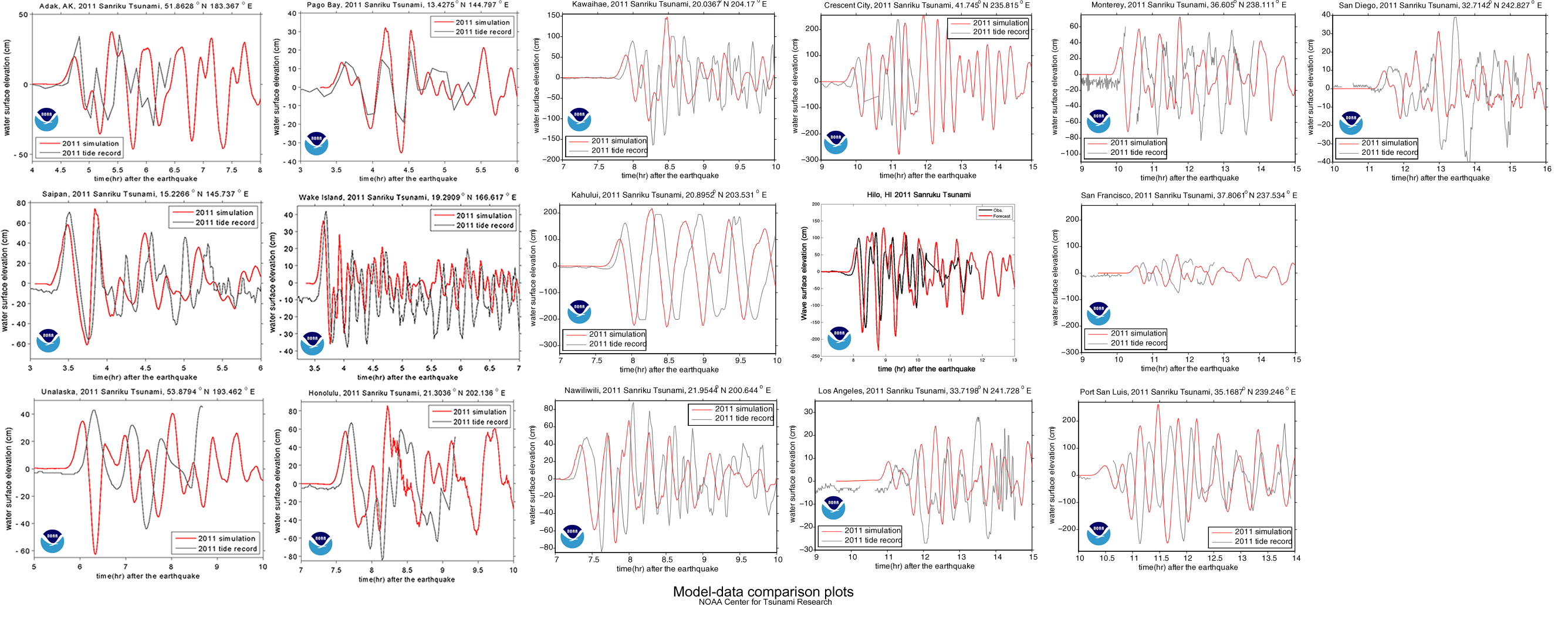
Of course, these are the results of computer simulations. As scientists, the people at NOAA who put together these plots are always trying to improve. Science involves a continuous series of refinements to better understand the world we live in, so the NOAA scientists compare their models to what really happen so they can learn something and do better in the future. Perhaps the best way to do this for the tsunami is by comparing the predictions of their models to the actual water height measured by tidal gages:
The red line is the tsunami's water height predicted by the NOAA computer models for Honolulu, Hawaii, while the black line is the actual water height, measured at a tidal gauge. Other comparisons can be found here.
You’ll notice that NOAA did not do a perfect job. They did get the amplitude (height) of the waves mostly right, but their timing was a little off. Since it’s about 6000 km from the earthquake epicenter to Honolulu, being off by a few minutes is no mean feat. Yet I’ll bet they’re still working on making it better, particularly since some of the other comparisons were not quite as good.
… a tsunami wave approaching land is more like a wall of whitewater. …. Since the wave is 100 miles long and the tail end of the wave is still traveling at 500 mph, the shore end of the wave becomes extremely thick, and is forced to run far inland, over streets and trees and houses. …. And remember, the water isn’t clean, but filled with everything dredged up from the sea floor and the land the wave runs over–garbage, parking meters, pieces of buildings, dead animals.
With recent hopes of democracy and a new renaissance of the Islamic world, it’s perhaps appropriate to look back at the contributions that came from Muslim lands. This includes works in the fields of optics, ecology, engineering, algebra, mostly done in the years between 800 and 1250 A.D.. David Beillo has a wonderful slideshow in Scientific American.
In 1647, when Johannes Hevelius published his treatise on the moon, he placed Muslim scientist Alhazen on the frontpiece (left) to represent reason. (Image by Jeremias Falck via Wikimedia Commons).
The Economist has a wonderful graphic of the countries in the Arab World. Click on the countries for information about the country, including things related to civil rights.
NPR’s Brian Reed has an excellent two-part series on the small island nation of Kiribati‘s preparations to adapt to global warming.
Kiribati. (Map from the U.S. Congress via Wikimedia Commons).
Small island nations are the most sensitive to the effects of global warming. Rising sea levels will substantially affect places where the land is just a few meters above sea level. But small islands also have limited capacity to adapt to significant changes.
These articles tie in to our questions of modern migration, which we discussed last cycle (C3) and environmental change.
[googleMap name=”Tarawa Island, Kiribati” description=”Tarawa is the capital of the Kiribati Islands” width=”480″ height=”480″ mapzoom=”10″ mousewheel=”false” directions_to=”false”]Tarawa Island, Kiribati[/googleMap]
The number of elementary students in private schools in the Memphis area. Image from the New York Times' Mapping America project.
The New York Times has made data from the U.S. census available in an interactive map. This is an excellent tool to play with, since it has geographic information about income, race, education and more. The data is at the census tract level, so it is quite detailed.
I can see using this app being very useful for local research projects. Simply comparing the location of the different racial populations in a city like Memphis to the spatial distribution of income or education would probably tell a lot that we already intuitively know.


