Polar Coordinates Animation

A couple quick programs (polarGraphs.py) to create animations of the drawing of functions in polar coordinates (for my pre-Calculus class).

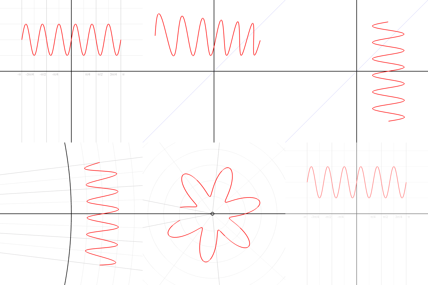
Graph of the function: r = 4 cos(θ)

It can export as a movie (mp4 as above). W can also transform functions (using: polarToCartesianGraph.py ) from rectangular to polar coordinates (and back: you can choose the settings).

Coordinate transforms Cartesian to Polar and back again for r = 4 cos(θ)

A Note on using ChatGPT

This python program uses the matplotlib library, and, for the first time for me, I used ChatGPT to figure out the syntax for things like drawing arcs and arrows, and exporting animation files, instead of googling my questions. ChatGPT worked great, and significantly speeded up the process. It does make me wonder, however, that since these models are based off of what they’ve scraped from the internet, are they going to run create problems for themselves if people stop asking questions on places like stackoverflow and rely on AI instead. Although, this might just mean that the AI will tend to be just be a little bit behind the cutting edge and there will continue to be a need for question and answer forums.
Introducing Limits (Calculus) with a Guitar

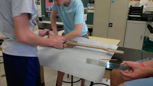
Creating the outline of a guitar.

One of the assigned tasks from last summer’s guitar building workshop was to create a few modules for use in class. I worked on an assignment that has students calculate the volume of a guitar body using trapezoidal approximation methods that can be a bridge between pre-calculus and calculus.

The first draft of this module is here: volume-activity-v01.pdf (the LaTeX file is volume-activity-v01.tex.zip ). It has made contact with the enemy students and the results have so far been very good.

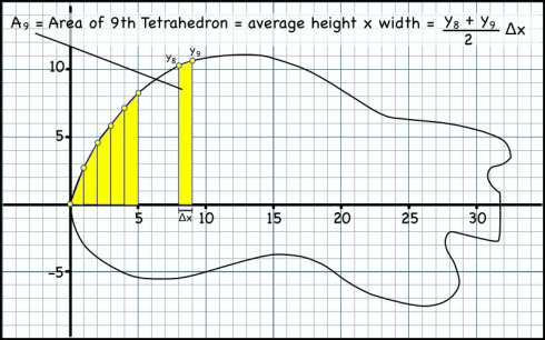
A method for finding the area of a guitar body by fitting trapezoids.

There were two things that I need to add for next time:

  1. How to find the area of a trapezoid: I should have some more detail about how I came up with the formula for calculating the area of each trapezoid (see the figure above). I multiply the average of the heights of the two sides of the trapezoid by the width of the base to get the area. Students tend to want to find the area of the lower rectangle, then add the area of the upper triangle. Their method gives the same answer for area, but results in a more complicated equation that takes more effort to generalize.
  2. Have them also find the slope of a tangent line to the outline of the guitar at a certain point. This assignment is intended to lead students up to the concept of limits with the idea that if you make the trapezoids thinner you’ll get less error in your calculation of the total area. So, as the width of the trapezoid approaches zero, you should get the exact area (with no error). The seemed to get that fairly well, however, when I get into the calculus, I actually first use limits to show them how to find derivatives of functions before I talk about finding areas under curves. As a result, I did ask the students to find the slope at a point on their guitar outline (I randomly chose a point from their outlines), and was very glad I did so. This should be included in the module.

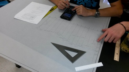
Students drawing trapezoids to fit the outline of the guitar, and calculating their areas.

Finally, in addition, I also showed them how to quickly calculate the trapezoid areas once they’d entered the coordinates of each point on their graphs into Excel. I did not test them on this afterward, so I’m not sure how much of it they absorbed.

A Concept Map for Mathematical Functions

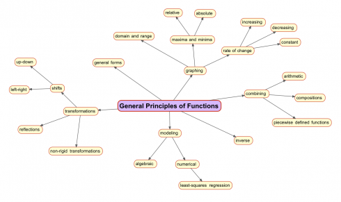
Analyzing functions.

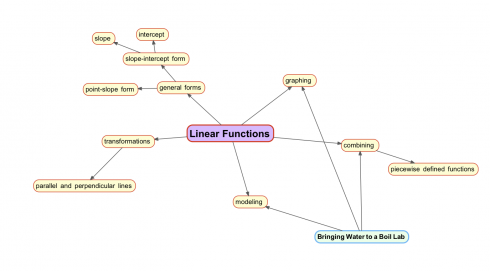
This year I’m trying teaching pre-Calculus (and it should work for some parts of algebra as well) based on this concept map to use as a general way of looking at functions. Each different type of function can by analyzed by adapting the map. So linear functions should look like this:

Adapting the general concept map for linear functions.

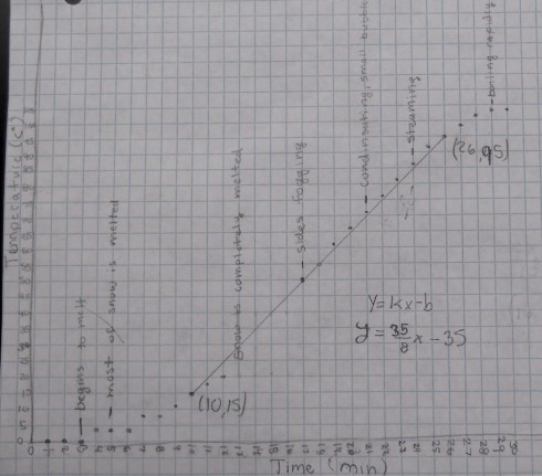
You’ll note the bringing water to a boil lab at the bottom left. It’s an adaptation of the melting snow lab my middle schoolers did. For the study of linear equations we’ll define the function using piecewise defined functions.

The rising temperatures in the middle of the graph can be modeled with a straight line. Graph by A.F.
The relationship between temperature and time on a hotplate. The different parts of the graph can be defined by a piecewise function. Graph by A.F.

Understanding the Extinction of the Dinosaurs (and the Survival of Mammals)

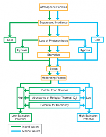
This neat paper (Robertson et al., 2013) in the Journal of Geophysical Research makes an interesting attempt to explain the pattern of extinctions that occurred at the end of the Cretaceous: why most of the dinosaurs died out, and why ocean organisms were more severely affected than freshwater organisms by the long winter after the asteroid impact.

The flow chart explains:

Diagram of contrasts between freshwater and marine environments for factors potentially causing extinction in aquatic environments after the Chicxulub impact. (Image and caption from Robertson et al., 2013).

They also include an interesting figure showing how long an organism might survive based on how large it is, which I may be able to use in pre-Calculus when we’re discussing log scales and linearizing equations.

Allometric relationship between body size and time to death by starvation for multicellular poikilotherms in the absence of food (red, drawn from the equation of Peters [1983, p. 42]). Names of various types of organisms are shown as an indication of body size. Image and caption from Robertson et al., 2013.
Allometric relationship between body size and time to death by starvation for multicellular poikilotherms in the absence of food (red, drawn from the equation of Peters [1983, p. 42]). Names of various types of organisms are shown as an indication of body size. (Image and caption from Robertson et al., 2013.)

The article is written well enough that an interested high school biology student should be able to decipher (and present) it.

Introducing Polynomials

If you recall, straight lines have a general equation that looks like this:

y=mx+b (1)

This is called the slope-intercept form of the equation, because m gives the slope, and b tells where the line intercepts the y-axis. For example the line:

y=2x-3 (2)

looks like:

Now, in the slope-intercept form, m and b represent numbers. In our example, m = 2 and b = 3.

So what if, instead of calling them m and b we used the same letter (let’s use a) and just gave two different subscripts so:

m = a_1 and,
b = a_0

therefore equation (1):

y=mx+b

becomes:
y = a_1 x + a_0 (3)

Now, in case you’re wondering why we picked m = a1 instead of m = a0, it’s because of the exponents of x. You see, in the equation x has an exponent of 1, and the constant b could be thought to be multiplying x with an exponent of 0. Considering this, we could rewrite our equation of the line (2):

y=2x^1-3x^0 (4)

since:
x^1 = x and,
x^0 = 1

we get:
y=2x-3(1)
y=2x-3

So in equation (3) the subscript refers to the exponent of x.

Now we can expand this a bit more. What if we had a term with x2 in an equation:

y=\frac{1}{2}x^2 + 2x - 3 (5)

Now we have three coefficients:

a_0 = -3 ,
a_1 = 2 and,
a_2 = \frac{1}{2} ,

And the graph would look like this.

Because of the x2 term (specifically because it has the highest exponent in the equation), this is called a second-order polynomial — that’s why the graph above has a little input box where the order is 2. In fact, on the graph above, you can change the order to see how the equation changes. Indeed, you can also change the coefficients to see how the graph changes.

A second order polynomial is a parabola, while, as you’ve probably guessed, a first order polynomial is a straight line. What’s a zero’th order polynomial?

Finally, we can write a general equation for a polynomial — just like we have the slope-intercept form of a line — using the a coefficients like:

y = a_n x^n + ... + a_2 x^2 + a_1 x + a_0

You can use the graphs to tinker around and see what different order polynomials look like, and how changing the coefficients change the graphs. I sort-of like the one below:

References

WolframAlpha has more details on polynomials.

The embedded graphs come from my own Polynomial Grapher.

Graphing Polynomials

Try it. You can change the order and coefficients of the polynomial. The default is the second order polynomial: y = x2.

I originally started putting together this interactive polynomial app to use in demonstrating numerical integration, however it’s a quite useful thing on its own. In fact, I’ve finally figured out how to do iframes, which means that the app is embeddable, so you can use it directly off the Muddle (if you want to put it on your own website you can get the embed code).

This app is a rewritten version of the parabola code, but it uses kineticjs instead of just HTML5 canvases. As a result, it should be much easier to adapt to make it touch/mouse interactive.

Working with Climate Data

Monthly climatic data from the Eads Bridge, from 1893 to the 1960’s. It’s a comma separated file (.csv) that can be imported into pretty much any spreadsheet program.

135045.csv

The last three columns are mean (MMNT), minimum (MNMT), and maximum (MXMT) monthly temperature data, which are good candidates for analysis by pre-calculus students who are studying sinusoidal functions. For an extra challenge, students can also try analyzing the total monthly precipitation patterns (TPCP). The precipitation pattern is not nearly as nice a sinusoidal function as the temperature.

Students should try to deconstruct the curve into component functions to see the annual cycles and any longer term patterns. This type of work would also be a precursor the the mathematics of Fourier analysis.

This data comes from the National Climatic Data Center (NCDC) website.