Since we most commonly talk about radioactive decay in terms of half lives, we can write the equation for the amount of a radioisotope (A) as a function of time (t) as:
where:
To reverse this equation, to find the age of a sample (time) we would have to solve for t:
Take the log of each side (use base 2 because of the half life):


Use the rules of logarithms to simplify:


Now rearrange and solve for t:
So we end up with the equation for time (t):
Now, because this last equation is a linear equation, if we’re careful, we can use it to determine the half life of a radioisotope. As an assignment, find the half life for the decay of the radioisotope given below.
Missouri’s confirmed cases (z-score) compared to the other U.S. states from April 20th to October 3rd, 2020. The z-score is a measure of how far you are away from the average. In this case, a negative z-score is good because it indicates that you’re below the average number of cases (per 1000 people). For all the states.
Based on my students’ statistics projects, I automated the method (using R) to calculate the z-score for all the states in the U.S. We used the John Hopkins daily data.
The R functions (test.R) assumes all of the data is in a folder (COVID-19-master/csse_covid_19_data/csse_covid_19_daily_reports_us/), and outputs the graphs to the folder ‘images/zscore/‘ which needs to exist.
Let’s take a look at the summary statistics for the number of confirmed cases, which is in the column labeled “Confirmed”:
> summary(mydata$Confirmed)
   Min. 1st Qu.  Median    Mean 3rd Qu.    Max.
    317    1964    4499   15347   13302  253060
This shows that the mean is 15, 347 and the maximum is 253,060 confirmed cases.
I’m curious about which state has that large number of cases, so I’m going to print out the columns with the state names (“Province_State”) and the number of confirmed cases (“Confirmed”). From our colnames command above we can see that “Province_State” is column 1, and “Confirmed” is column 6, so we’ll use the command:
> mydata[ c(1,6) ]
The “c(1,6)” says that we want the columns 1 and 6. This command outputs
             Province_State Confirmed
1                   Alabama      5079
2                    Alaska       321
3            American Samoa         0
4                   Arizona      5068
5                  Arkansas      1973
6                California     33686
7                  Colorado      9730
8               Connecticut     19815
9                  Delaware      2745
10         Diamond Princess        49
11     District of Columbia      2927
12                  Florida     27059
13                  Georgia     19407
14           Grand Princess       103
15                     Guam       136
16                   Hawaii       584
17                    Idaho      1672
18                 Illinois     31513
19                  Indiana     11688
20                     Iowa      3159
21                   Kansas      2048
22                 Kentucky      3050
23                Louisiana     24523
24                    Maine       875
25                 Maryland     13684
26            Massachusetts     38077
27                 Michigan     32000
28                Minnesota      2470
29              Mississippi      4512
30                 Missouri      5890
31                  Montana       433
32                 Nebraska      1648
33                   Nevada      3830
34            New Hampshire      1447
35               New Jersey     88722
36               New Mexico      1971
37                 New York    253060
38           North Carolina      6895
39             North Dakota       627
40 Northern Mariana Islands        14
41                     Ohio     12919
42                 Oklahoma      2680
43                   Oregon      1957
44             Pennsylvania     33914
45              Puerto Rico      1252
46             Rhode Island      5090
47           South Carolina      4446
48             South Dakota      1685
49                Tennessee      7238
50                    Texas     19751
51                     Utah      3213
52                  Vermont       816
53           Virgin Islands        53
54                 Virginia      8990
55               Washington     12114
56            West Virginia       902
57                Wisconsin      4499
58                  Wyoming       317
59                Recovered         0
Looking through, we can see that New York was the state with the largest number of cases.
Note that we could have searched for the row with the maximum number of Confirmed cases using the command:
> d2[which.max(d2$Confirmed),]
Merging Datasets
In class, we’ve been editing the original data file to add a column with the state populations (called “Population”). I have this in a separate file called “state_populations.txt” (which is also a comma separated variable file, .csv, even if not so labeled). So I’m going to import the population data:
> pop <- read.csv("state_population.txt")
Now I’ll merge the two datasets to add the population data to “mydata”.
> mydata <- merge(mydata, pop)
Graphing (Histograms and Boxplots)
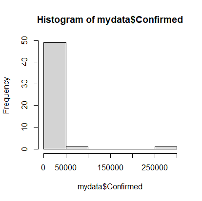
With the datasets together we can try doing a histogram of the confirmed cases. Note that there is a column labeled “Confirmed” in the mydata dataset, which we’ll address as “mydata$Confirmed”:
> hist(mydata$Confirmed)
Histogram of confirmed Covid-19 cases as of 04-20-2020.
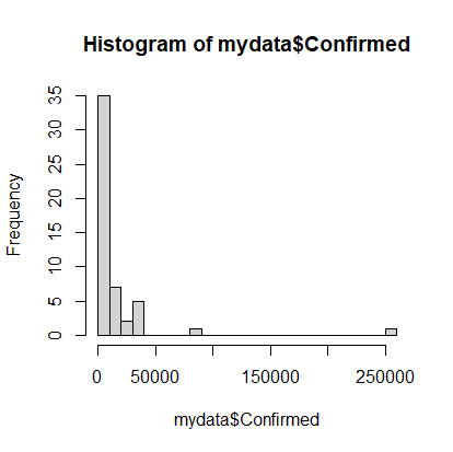
Note that on April 20th, most states had very few cases, but there were a couple with a lot of cases. It would be nice to see the data that’s clumped in the 0-50000 range broken into more bins, so we’ll add an optional argument to the hist command. The option is called breaks and we’ll request 20 breaks.
> hist(mydata$Confirmed, breaks=20)
A more discretized version of the confirmed cases histogram.
Calculations (cases per 1000 population)
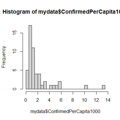
Of course, simply looking at the number of cases in not very informative because you’d expect, with all things being even, that states with the highest populations would have the highest number of cases. So let’s calculate the number of cases per capita. We’ll multiply that number by 1000 to make it more human readable:
The dataset still has a long tail, but we can see the beginnings of a normal distribution.
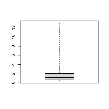
The next thing we can do is make a boxplot of our cases per 1000 people. I’m going to set the range option to zero so that the plot has the long tails:
> boxplot(mydata$ConfirmedPerCapita1000, range=0)
Boxplot of US states’ confirmed cases per 1000 people.
The boxplot shows, more or less, the same information in the histogram.
Finding Specific Data in the Dataset
We’d like to figure out how Missouri is doing compared to the rest of the states, so we’ll calculate the z-score, which tells how many standard deviations you are away from the mean. While there is a built in z-score function in R, we’ll first see how we can use the search and statistics methods to find the relevant information.
First, finding Missouri’s number of confirmed cases. To find all of the data in the row for Missouri we can use:
> mydata[mydata$Province_State == "Missouri",]
which gives something like this. It has all of the data but is not easy to read.
   Province_State Population Country_Region         Last_Update     Lat
26       Missouri    5988927             US 2020-04-20 23:36:47 38.4561
      Long_ Confirmed Deaths Recovered Active FIPS Incident_Rate People_Tested
26 -92.2884      5890    200        NA   5690   29      100.5213         56013
   People_Hospitalized Mortality_Rate      UID ISO3 Testing_Rate
26                 873       3.395586 84000029  USA      955.942
   Hospitalization_Rate ConfirmedPerCapita1000
26             14.82173              0.9834817
To extract just the “Confirmed” cases, we’ll add that to our command like so:
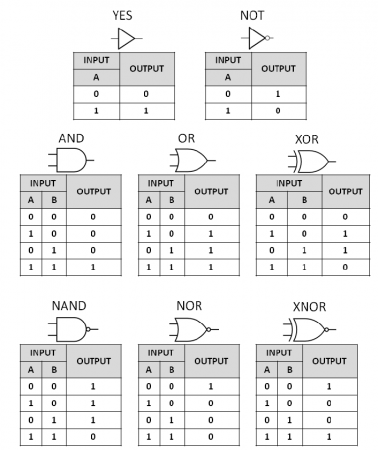
To follow up on the introduction to Logic Gates post, this assignment is intended to help students practice using functions and logic statements.
Write a set of function that act as logic gates. That is, they take in one or two inputs, and gives a single true or false output based on the truth tables. Write functions for all 8 logic gates in the link. An example python program with a function for an AND gate (the function is named myAND) is given in the glowscript link below.
Write a function that uses these functions to simulate an half-adder circuit. Create a truth table for the input and output.
Write a function that uses the gate functions to simulate a full-adder circuit. Create a truth table for the input and output.
Logic gates are the building blocks of computers. The gates in the figure above take one or two inputs (A and B) and give different results based on the type of gate. Note that the last row of gates are just the opposite of the gates in the row above (NAND gives the opposite output to AND).
As an example, two gates, an AND and an XOR, can be used to make a half-adder circuit
Half adder circuit
By feeding in the four different combinations of inputs for A and B ([0, 0], [1, 0], [0, 1], and [1, 1]) you can see how these two gates add the two numbers in binary.
Creating a truth table for the half adder.
I find this to be an excellent introduction to how computers work and why they’re in binary.
Are the elements of larger atoms harder to melt than those of smaller atoms?
We can investigate this type of question if we assume that bigger atoms have more protons (larger atomic number), and compare the atomic number to the properties of the elements.
Your job is to use the data linked above to draw a graph to show the relationship between Atomic Number of the element and the property you are assigned.
Question 2.
What is the relationship between the number of valence electrons of the elements in the data table and the property you were assigned.
Bonus Question
Bonus 1: The atomic number can be used as a proxy for the size of the element because it gives the number of protons, but it’s not a perfect proxy. What is the relationship between the atomic number and the atomic mass of the elements?
These atom boards worked very well for practicing how to interpret atomic symbols. The protons (blue) and electrons (red) are magnetic so they snap into place quite satisfyingly. Their poles are oriented so that the electrons will only attach properly to the slots in the electron shells and the protons only attach the right way up to the nucleus. The neutrons are wooden and non-magnetic.
Procedure for Building an Atom
Nucleus
Step 1: Number of protons (+ charge).
The number of protons is given by the element name. Carbon will always have six protons, Hydrogen will have one proton. I have students memorize the first twenty elements in the correct order, so they can quickly determine the atomic (proton) number.
14C: Protons = 6+
Step 2: Number of neutrons.
Neutrons = atomic mass – number of protons
The atomic mass is given at the top left corner of the atomic symbol: 14 in the example above for 14C.
14C: Neutrons = 14 – 6 = 8
Electron Shells
Step 3: Number of electrons (- charge).
Electrons = number of protons – charge
The charge is given to the top right of the atomic symbol. In this case, there is no charge
14C: Electrons = 6 + 0 = 6
Step 4: Electron Shells
Electrons go in shells around the nucleus.
Start with the smallest shell, fill it, and then add the next shell until you’ve placed all of the electrons.
The first shell can hold only 2 electrons, the second shell can hold 8, and the third 8. The electron configuration tells how many electrons are in each shell.
14C: Electron configuration: 2-4
Building atoms with the atom board.
They’ve also turned out to be useful when explaining ionic bonding. Since it’s easy to add or remove electron shells, you can clearly show how many electrons can be donated or received to figure out how many atoms are involved in the reactions.
The family of Raspberry Pi’s are just really small computers. You can plug a monitor, keyboard, and mouse into one and it will not look too different from your desktop. They are small and cheap, but what makes them really useful is that they have little slots (called GPIO’s) that you can stick wires into that allow you to build circuits that can get information from sensors and control devices like LED lights or motors.
This is a quick introduction about how to set one up. You’ll find lots of great tutorials on the internet. This one is specific to my needs: it’s an introduction to the Pi’s for students who are new to them; I’m setting it up with a web server so we can control the devices through a webpage; and I’m setting it up so you can control the Pi “headlessly”, which means you don’t need the keyboard, mouse, etc..
Installing the Operating System
Downloading the OS
Download: The operating system files can be downloaded from the Raspberry Pi website. We’re going to use the Raspbian Desktop version with the recommended software.
Your typical computer has a built in hard drive that stores the data you save, the programs/apps you install, and the operating system (OS) that runs it all. When you start the computer the first thing it does is read the files that make up the operating system from the hard drive and set them up in the active, processing memory (RAM). Then when you interact with the computer (type on the keyboard, click the mouse etc.) you’re interacting with the operating system: you tell the operating system what to do, like start up a web browser (Firefox, Chrome, Safari, Explorer, Opera etc.), and it does it. And when your apps want to do something, like save a file, they have to ask the operating system to do it.
On the Raspberry Pi the data for the operating system is not stored on a built in hard drive, but on an SD card (or microSD), which means that you’re going to have to install the operating system yourself to get your Pi running. You can find the operating system at the Raspberry Pi website’s download page.
Installing
As of this writing, I’ve been using balenaEtcher to install the operating system on the SD Card.
balenaEtcher is free and pretty easy to use. Hopefully, your computer has an SD card port, if not you’re going to have to find an adapter. Just plug your SD card into your computer and run Etcher, it will ask you to:
Select Image: Which is the Raspbian file you downloaded
Select Drive: Which should default to the SD card you plugged in (check the size of the drive to make sure)
Flash: Which writes the Operating System files to the SD card, making sure everything is in the right place.
You may see some warnings pop up about Unrecognized Files Systems or similar. You can just close those windows.
When the flashing is done, don’t take the SD card out of your computer (or put it back in if you have) just quite yet. We’re going to set it up so the Pi can automatically connect to the WiFi, which will make it easier to talk to.
Setting Up WiFi
You’re going to have to edit some files on the SD card to give the Pi the information about the WiFi situation so that it can automatically connect. This is most useful if you’re not going to plug in a keyboard and monitor and just want to control the Pi from your computer (more on how to do this later). If you do want to go the keyboard and mouse route, you can just plug the SD card into the Pi, power it up, and set up the WiFi like you would normally do on your laptop.
To edit the files I use Atom on Windows or TextEdit which is built in on Mac. These programs should allow you to easily save files as plain text, without any of the fancy styling that will create errors when the Pi operating system tries to get the information from the files.
WiFi
Create a new file called: “wpa_supplicant.conf” (based on these notes) containing:
Save this file to the boot directory of the SD card.
ssh
ssh allows you to remotely connect to your Pi’s operating system. This means that you can use your laptop to control the Pi (however you’ll be using command line commands).
Create an empty file named “ssh” and save it to the boot directory of your SD card.
USB connection
You should be able to find your Pi on the network (I use an app on my phone called Fing) and ssh in. However, to do most of the setup, especially if the Pi has trouble connecting to the WiFi (or you can’t find it on the network), you’ll probably want to set up your pi so you can plug it into your computer’s USB port and control it from the computer. Based on the notes from Adafruit, do this:
Open the file “config.txt” which is in the SD card’s boot directory, and add this as the last line in the file:
dtoverlay=dwc2
Save the file then:
Open the file “cmdline.txt”, find the word “rootwait” and, after it, insert the phrase:
modules-load=dwc2,g_ether
You should end up with something that looks like “…=yes rootwait modules-load=dwc2,g_ether quiet…”:
Connecting to your Pi
To talk to your Pi’s Operating System you should be able to connect your Pi’s USB port to your computer’s or connect over WiFi. Either way you’ll need to use an ‘ssh’ program.
Windows: I use putty. Install the program and run it. Then you’ll need to enter:
Host Name: raspberrypi.local
Password: raspberry
Mac: I use the built-in Terminal (In your Applications->Utilities folder). Type in the command (don’t type in the “>”):
> ssh raspberrypi.local
Use the password: raspberry
If you go the WiFi route, you’ll need to find your Pi’s IP address and use that as the Host Name.
Update and Upgrade
Once you’re ssh’d in, and are connected the internet, you can update and upgrade the operating system. Type in the commands (without the “>”).
> sudo apt-get update
> sudo apt-get upgrade
The “sudo” means you’re giving yourself permission to run commands that could potentially mess up your system. The program you’re running is called “apt-get” which connects to the internet repositories with the latest updates and upgrades to your operating system and programs, and then downloads and installs them. The options “update” and “upgrade” specifically tells the “apt-get” program what you want it to do. Downloading and upgrading may take a while.
Enable Interfaces
You’ll also want to check that the interfaces to the GPIO pins are enabled, so you can build circuits and control them. Notes on this are here.
First check that your tools are installed and updated with the commands:
Then Activate the Interfaces. You’ll run the command “raspi-config” and then use your keyboard to tab through the windows to activate the I2C and SPI interfaces. These are just two different ways for the Pi to talk to the devices you plug into it.
The tornado server allows us to create webpages on the Pi that we can connect to over WiFi that can be used to control devices connected to the Pi. Install tornado using:
where:

Use the rules of logarithms to simplify:


Now rearrange and solve for t:


