Ice-Albedo: A not-so-Positive Feedback

This summer’s arctic ice cap is the smallest since we’ve started watching it from space in the 1970’s, and the summer isn’t over yet.

Over the last few years, the rate at which the ice is melting is accelerating, probably due to the ice-albedo feedback. Albedo refers to how reflective a surface is; the average of the Earth is about 31%, while snow and ice has an albedo closer to 90%.

When the albedo is high, a lot of sunlight is reflected back into space, but when it’s lowered, such as when the sea-ice melts, the surface absorbs a lot more sunlight, which heats it up. Of course, more heat melts more ice which further decreases the albedo which causes more warming which melts more ice …. And you can see the problem.

The ice albedo feedback takes a small change (melting ice) and accelerates it. That’s a positive feedback, although the effects are usually not what you want, because they take the system (the Earth’s climate in this case) away from it’s current equilibrium. This is not to say that there are no benefits; the Northwest Passage will open up eventually, if it has not already.
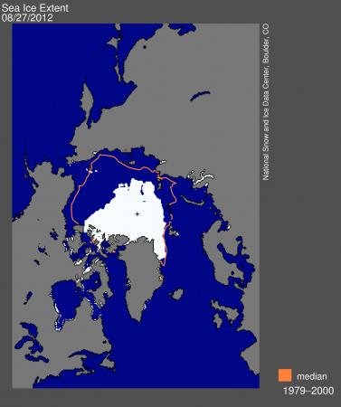
Extent of Arctic sea-ice at the end of August 2012. The orange line shows the average extent (1979-2000). We're a bit on the low side at the moment. Data from the National Snow and Ice Data Center.

ClimateCentral.org the NSIDC

Spring is Coming Earlier

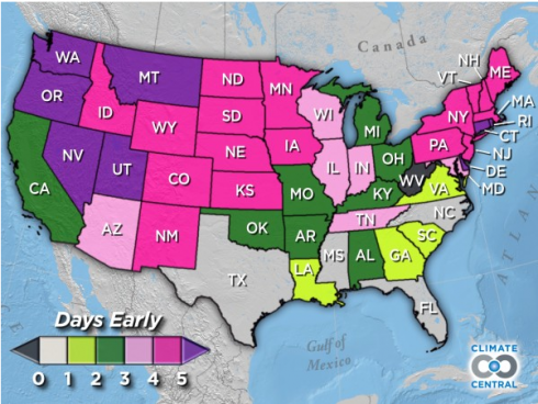
The average change in the date of "first leaf" in the United States. Note that states farther to the north have seen greater change. Image from the interactive by Climate Central.

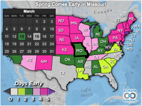
In Missouri, between 1981 and 2010 the average date at which trees first showed their leaves was two days earlier than the average between 1951 and 1980, according to this graphic by Climate Central.

You’ll also note the north-south trend, where change is greater as you go north. Most models predict that global warming/climate change due to increasing carbon dioxide will result in bigger changes as you get toward the poles.

The map is based on data from the National Phenology Network. The National Phenology Network has a good educational resource page, as well as access to their datasets.

Spring has been coming two days earlier (on average) in Missouri. Image from Climate Central.

Where the Trees Are

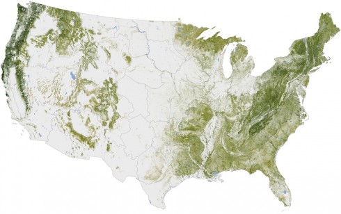
Map of Woody Biomass in the U.S. in the year 2000, by the Woods Hole Research Center, via NASA's Earth Observatory.

The Woods Hole Research Center put together this map of “Aboveground Woody Biomass” that essentially shows where the trees are in the U.S.. The map was created using, primarily, satellite imagery. Their website has a nice, interactive, version of the map, and a 3d video flyover of the of southeastern Georgia.

Trees build their woody biomass using carbon from the atmosphere (remember during photosynthesis plants absorb carbon dioxide gas), so these trees are represent stored carbon. If they are burned their carbon is released to the atmosphere. If more trees are planted then they will absorb more carbon dioxide from the atmosphere. This map serves as an inventory of what we have now; a baseline for discussions about what to do about carbon-driven climate change.

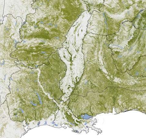
The Mississippi River flood plain shows up remarkably well because of it's lack of trees. Flood plains are great for agriculture.

Methane from Landfills: The Uses Of

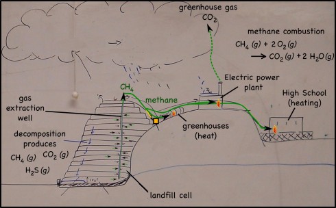
Methane in a landfill. It's produced by decomposing organic material, is extracted via wells, and is then burned to produce heat (for a school and a set of greenhouses) and electricity (soon anyway).

Decomposing waste in landfills produces quite a lot of methane gas (CH4). Perhaps better known as natural gas, methane is one of the simplest hydrocarbons, and a serious atmospheric pollutant (it’s a powerful greenhouse gas). In the past the methane produced was either released into the atmosphere or just burned off.

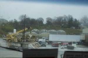
Greenhouses that are warmed by methane produced by the landfill. It's a cheap, close source of energy.

I remember seeing the offshore oil rigs burning natural gas all night long — multiple miniature sunrises on the horizon — in the days before the oil companies realized they could capture the gas and sell it or burn it to produce energy. The landfill companies have realized the same thing. So now, wells pockmark modern landfills and the methane is captured and used.

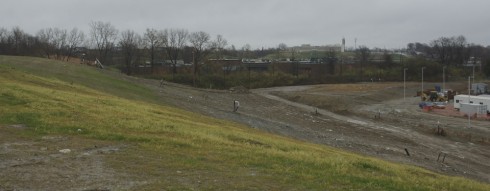
Looking down the slope of the landfill to see the Pattonville High School, which uses natural gas from the landfill for heating.

First, of course, the hydrogen sulfide gas (H2S), is separated from the methane — H2S produces acid rain, so it’s emissions are limited by the EPA — then, the gas from the landfill we visited, is piped to:

  • greenhouses, where it’s burnt to produce heat;
  • the Pattonville High School, which is right next to the landfill and burns the gas for heating;
  • and (soon) to a electricity generating power plant that will burn the gas to produce heat which will boil the water that will produce the steam that will turn the turbines that will generate the electricity.
Electric power plant -- still under construction -- that's fueled by methane from the landfill.

You may have noticed the common theme of all these uses of natural gas: it has to be burned to be useful. The combustion reaction is:

CH4 (g) + 2 O2 (g) —-> CO2 (g) + 2 H2O (g)

which produces carbon dioxide (CO2) that is also a greenhouse gas, but is, at least, not nearly as powerful at greenhouse warming as is methane.

Global Warming Art

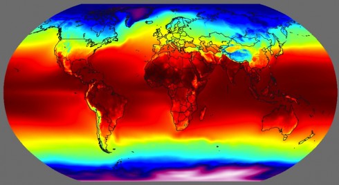
Global temperatures (averaged from 1961-1990). Image created for Global Warming Art by Robert A. Rohde.

Talk about evoking conflicting emotions. The image is astoundingly beautiful – I particularly like the rich, intense colors – but the subject, global warming, always leaves me with sense of apprehension since it seems so unlikely that enough will be done to ameliorate it.

The source of the image, Global Warming Art has a number of excellent images, diagrams and figures. The National Oceanic and Atmospheric Administration also has lots of beautiful, weather-related diagrams. I particularly like the seasonal temperature change animation I made from their data.

Global Warming and Changing Ecological Niches

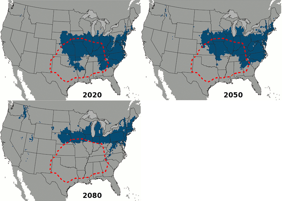
As climate changes, biomes move, and the range of the brown recluse spider migrates north and east (blue area) from its current location (red dashed line). Image adapted from Saupe et al. (2011).

Just in time for us to learn about global change, this interesting study on the expanding range of brown recluse spiders came out. Once restricted to the southern U.S. and the midwest, future climate change will allow them to expand north to Minnesota and east into Pennsylvania.

The researchers, Saupe et al. (2011), used ecological niche modeling. This method takes known information about where the spiders live, such as climate (e.g. summer temperatures) or topography (e.g. mountains versus plains), to figure out the current extent of their ecological niche. Then they use climate models to figure out where those same conditions will apply in the future. Thus the spiders march north.

Global Warming: Yes, it’s Warming

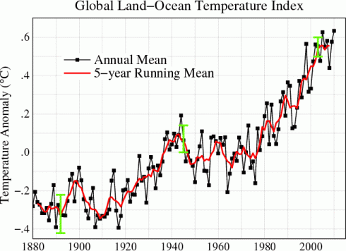
Global warming over the last 130 years. The graph shows the temperature anomaly, which is the difference in temperature from the average (0 on the graph). The total change from the 1820's is about 0.8 degrees Celsius. Graph from NASA GISS.

NASA’s Goddard Institute for Space Science has an excellent page that is updated every month, which shows graphs of global temperature changes.

IN addition to the global graphs, there are a lot of really neat graphs showing:

  • separate graphs from the tropics versus the northern hemisphere versus the southern hemisphere (the different latitude bands);
  • the difference between the northern and southern hemispheres;
  • the U.S. only;
  • seasonal changes.

The graphs typically show the temperature anomaly, which is the difference in temperature from the normal. The “normal” is taken to be the average temperature between 1951 and 1980.