Adam Hadhazy, in Discover Magazine, summarizes the top candidates to explain dark matter and the experiments in progress to find them. These include, WIMPs (Weakly Interacting Massive Particles, Axions, Sterile Neutrinos, and SIMPs (Strongly Interacting Massive Particles.
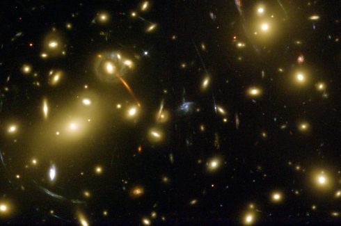
Distortions in the shapes of galaxies caused by gravitational lensing. While gravitational lensing is caused by anything with gravity (this means normal matter as well) the lensing effect of dark matter is a key form of evidence for its presence. Image of the galaxy cluster Abell 2218 via Wikimedia Commons.
via Brian Resnick on Vox, who provides some very interesting historical context on the discovery of dark matter.
A couple videos by CCP Grey that are great introductory explanations about how genetic algorithms (main video) and deep learning work (and how we’re being used to train these algorithms).
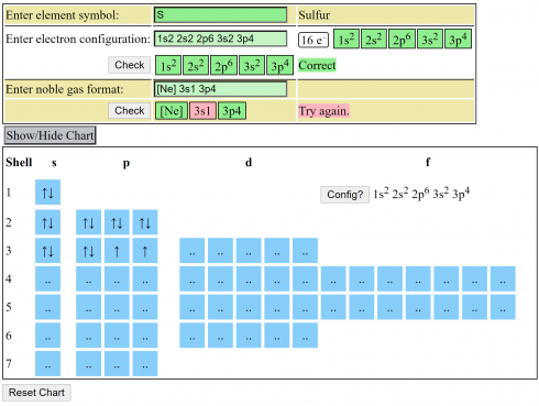
A quick electron configuration practice webpage that lets you enter the symbol for an element and see if you can write out the electron configuration in both the full and noble gas forms.
Screen capture from the electron configuration webpage. Sulfur (S) is entered, and then the long form and noble gas form of the configurations can be entered and checked. In this case, there is an error in one part of the noble gas form.
The table at the bottom is a guide to filling the electron shells and orbitals. You can click any of the blue squares to change the number of electrons in the orbital.
Since we most commonly talk about radioactive decay in terms of half lives, we can write the equation for the amount of a radioisotope (A) as a function of time (t) as:
where:
To reverse this equation, to find the age of a sample (time) we would have to solve for t:
Take the log of each side (use base 2 because of the half life):


Use the rules of logarithms to simplify:


Now rearrange and solve for t:
So we end up with the equation for time (t):
Now, because this last equation is a linear equation, if we’re careful, we can use it to determine the half life of a radioisotope. As an assignment, find the half life for the decay of the radioisotope given below.
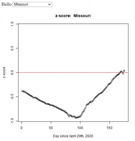
Missouri’s confirmed cases (z-score) compared to the other U.S. states from April 20th to October 3rd, 2020. The z-score is a measure of how far you are away from the average. In this case, a negative z-score is good because it indicates that you’re below the average number of cases (per 1000 people). For all the states.
Based on my students’ statistics projects, I automated the method (using R) to calculate the z-score for all the states in the U.S. We used the John Hopkins daily data.
The R functions (test.R) assumes all of the data is in a folder (COVID-19-master/csse_covid_19_data/csse_covid_19_daily_reports_us/), and outputs the graphs to the folder ‘images/zscore/‘ which needs to exist.
For a Statistics project, I took raw COVID data from John Hopkins University on May 20, 2020. With the data, I found the general statistics and then compared how cases are going up in Missouri every month.
State
Confirmed
Deaths
Population
CasesPerCapita
Alabama
13052
522
4779736
2.73069475
Alaska
401
10
710231
0.564605037
Arizona
14906
747
6392017
2.33197127
Arkansas
5003
107
2915918
1.715754695
California
85997
3497
37253956
2.30839914
Colorado
22797
1299
5029196
4.532931308
Connecticut
39017
3529
3574097
10.91660355
Delaware
8194
310
897934
9.125392289
District of Columbia
7551
407
705749
10.69927127
Florida
47471
2096
18801310
2.524877256
Georgia
39801
1697
9687653
4.108425436
Hawaii
643
17
1360301
0.4726895003
Idaho
2506
77
1567582
1.598640454
Illinois
100418
4525
12830632
7.826426633
Indiana
29274
1864
6483802
4.514943547
Iowa
15620
393
3046355
5.127439186
Kansas
8507
202
2853118
2.981650251
Kentucky
8167
376
4339367
1.88207174
Louisiana
35316
2608
4533372
7.790227672
Maine
1819
73
1328361
1.369356673
Maryland
42323
2123
5773552
7.330496027
Massachusetts
88970
6066
6547629
13.5881248
Michigan
53009
5060
9883640
5.363307445
Minnesota
17670
786
5303925
3.331495072
Mississippi
11967
570
2967297
4.032963333
Missouri
11528
640
5988927
1.92488571
Montana
478
16
989415
0.4831137591
Nebraska
11122
138
1826341
6.089771844
Nevada
7388
377
2700551
2.735738003
New Hampshire
3868
190
1316470
2.938160383
New Jersey
150776
10749
8791894
17.14943333
New Mexico
6317
283
2059179
3.067727478
New York
354370
28636
19378102
18.28713669
North Carolina
20262
726
9535483
2.124905471
North Dakota
2095
49
672591
3.114820151
Ohio
29436
1781
11536504
2.551552879
Oklahoma
5532
299
3751351
1.474668726
Oregon
3801
144
3831074
0.992149982
Pennsylvania
68126
4770
12702379
5.36324731
Rhode Island
13356
538
1052567
12.68897847
South Carolina
9175
407
4625364
1.983627667
South Dakota
4177
46
814180
5.130315164
Tennessee
18412
305
6346105
2.90130718
Texas
51673
1426
25145561
2.054955147
Utah
7710
90
2763885
2.789551664
Vermont
944
54
625741
1.50861139
Virginia
32908
1075
8001024
4.112973539
Washington
18971
1037
6724540
2.821159514
West Virginia
1567
69
1852994
0.8456584317
Wisconsin
13413
481
5686986
2.35854282
Wyoming
787
11
563626
1.396315997
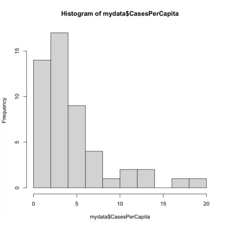
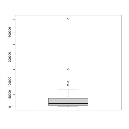
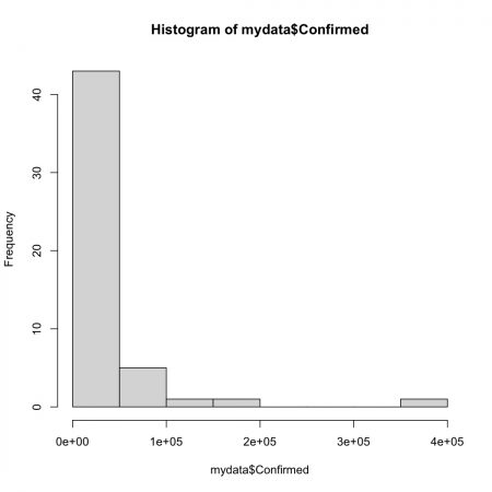
The Table above is the raw data I extracted but I added the population of each state and then calculated the cases per capita by dividing the confirmed cases by the population. This allows you to compare each state equally.
After getting the raw data I did the statistical analysis on the confirmed cases and cases per capita.
Confirmed Cases
Min.
401
Q1
5268
Median
13052
Q3
34112
Max
354370
Mean
30364
Inter-Q
28844
Standard Div
5513.53
Missouri
11528
Missouri Z
-3.416323118
The data above is the analysis from the confirmed cases. The analysis is for all 50 states.
Confirmed Cases per Capita
Min.
0.4727
Q1
1.9543
Median
2.9013
Q3
5.2468
Max
18.2871
Mean
4.4639
Inter-Q
3.2925
Standard Div
4.101132
Missouri
1.92488571
Missouri Z
-0.6191008458
The data above is the analysis from the confirmed cases per capita. The analysis is for all 50 states.
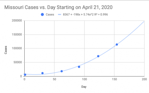
Missouri Predictions
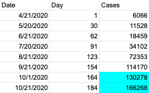
After I did the analysis for all 50 states I focused on the rise of cases in Missouri from April to September. Then I predicted the number of cases in the future if the rise in cases stays the same. More than likely the cases will be higher or lower than the predicted number. If the state implements safety precautions the curve could flatten out. If the state does nothing and people keep taking it less and less seriously than more then likely the curve will get stepper.
Above are the data and graphs I used to predicate the cases at the beginning of October and End. The two highlighted boxes are the predictions.
I predict there will be 130,278 cases in Missouri on the first of October. On the 21st I predict there will be 166,268 cases.
 where:

 Use the rules of logarithms to simplify:


 Finally rearrange a little:


 where:


