A few interesting, low-cost but potentially lab-grade, microscopes that would be great Makerspace projects for students.
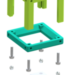
OpenFlexure: Out of the University of Bath, this has a Raspberry Pi at the core that can control the stage, focus, and sensor (using the RPi camera module). Since it’s modular the cost varies with the image quality you’re aiming for, but it looks like you can achieve even high resolution results relatively cheaply. They have great detail on their website, including their own version of Raspbian to install on the Pi, so this looks like an good starter project.
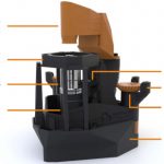
UC2: I really like the look of this building block, LEGO-style, system. It seems extremely flexible and there are some interesting projects that go beyond your standard microscope. There are a lot of designs you can go with, including an Arduino or using a Raspberry Pi and camera, but they claim to get good results just with smartphones. This is a big, sprawling project, which suggests a slightly steeper learning curve.
Hat tip to Maggie Eisenberger for introducing me to these.


 ) changes it from:

 ) while the second term has a plain radius denominator (
 ).
).
 where:

 Use the rules of logarithms to simplify:


 Finally rearrange a little:


 where:


